Draw Duke Street: Illustrating space as collaborative, socially engaged practice. M. Miller17/12/2016
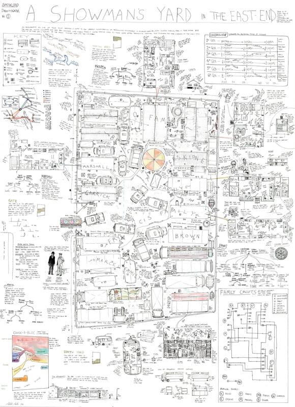 Mitch Miller: Showman's yard (2012) MILLER, M. (2013). Illustrating space as collaborative, socially engaged practice: The first report from the DRAW DUKE STREET residency. VaroomLab (2) p 24-40 Mitch Miller is a PhD student at Glasgow School of Art, and an illustrator. His paper’ draw Duke Street’ was presented as part of the VaroomLab symposium, ‘Spacialising Illustration’ in January 2013. The intended audience are students, illustrators, academics and the residents of Duke Street. The Draw Duke Street project is a socially engaged documentary drawing project, set in an underprivileged area of Glasgow. This paper is a report on the processes involved and to test and develop a methodology. Can a ‘Dialectogram’ fit a socially engaged model of work? A Dialectogram (a term coined by Miller) is a combination of plan, diagram, text and drawings, Miller has a background in social anthropology and identifies himself as an ethnographer. He chooses subjects that are commonly overlooked, misunderstood or are in an area undergoing change.The Duke Street residents are a carnival community. Draw Duke Street is a collaborative project where the subjects themselves generate the content; a mix of stories, memories and fact, which can take weeks and months to collect. The multimodal use of text and image is not explicitly mentioned, but the text is used for documentary detail and authenticity (over 30 hours of interviews were conducted). Miller describes the work of the Reportager group, and Olivier Kugler, Julien Malland and Joe Sacco, as also working in an ethnographic tradition. Miller also candidly documents the many problems associated with public collaboration. He reaches the conclusion that awareness of the area was raised despite the impossible deadline, and despite the difficulty of working with the input of so many people, and with so much information. It was also a successful test of the methodology and helped him to prepare for his subsequent case test in Govan, Glasgow. The paper is useful in that it clearly documents problems associated with collaborative work, and offers suggestions for improvement. It sets out a clear methodology and is honest about the potential and real pitfalls. In my own project, I am gathering personal testimonies and narratives through interview so Miller’s methodology is relevant to the work I am doing. He has also gathered his information- a mix of fact and fiction, from multiple sources and used text, drawing, data and diagram to communicate the whole picture. MILLER, M. (2013) Glasgow dialectograms, drawing a disappearing city. [online]
Available at: https://dialectogram.wordpress.com/ [Accessed 17 December 2016] 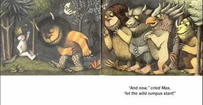 Fig 1: Maurice Sendak: Where the Wild Things are. (1963) Harper and Row SIPE, L. (1998) How picture books work: A semiotically framed theory of text-picture relationships. Children’s literature in Education Vol 29 (2) p97-108 [online] . Available from: http://web.a.ebscohost.com.ezproxy.herts.ac.uk/ehost/pdfviewer/pdfviewer?sid=52fb9a64-da7b-46b2-8ea3-ac13be3fa4d4%40sessionmgr4010&vid=1&hid=4109(Accessed 13 December 2016)
Sipe has a PhD in Children’s literature and has a research interest is in the development of literary understanding. I’ve chosen this article as I’ve introduced text as an integral element in my illustrations and want to clarify how they are read and understood with each other. In this article, Sipe examines the image-text relationship within picture books, but it is relevant wherever image and text exist together. The article begins by referencing alternative descriptions of the relationship using metaphors from music (antiphonal, duet), science (interference) and geology (plate techtonics). Sipe then briefly explains other approaches to defining the image text relationship, and includes the ideas of Barthes, Nodelman and Lewis, among others. Sipes theoretical approach is phenomenological. He identifies the relationship as a synergy, where the value together is stronger than the values individually. Sipe then systematically refers to a range of literary theories that examine the reader response to a text, and their perception of meaning. He goes onto explain the reflective process of reading a book and how this creates a tension between wanting to read on with the words, but dwell on the images. He suggests that the way a picture book is read invites re-reading because the tension stops a full-speed-ahead read. The second part of the article is about transmediation, and uses the semiotic theories of Pierce to explain how a reader moves between the dual sign systems of visual and verbal to create an understanding of the whole text. A double page spread from “Where the wild things are’, by Maurice Sendak is analysed through a Piercean semiotic triad (simpler than it sounds!). Plainly put, it’s where the eyes travel over the narrative space, and how the reader interprets and relates the visual and verbal signs. This is a useful and concise dissection of how text and image work together. It has a thorough bibliography for further study, and an overview of the leading theories. Particularly useful for my own project is the idea of hyperlinking between text, image and from page to page. 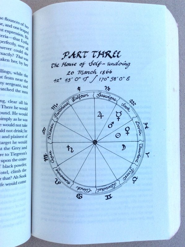 fig 1 Barbara Hilliam. A Chart in The Luminaries, by Eleanor Catton (2014) Granta Books MORGAN, C. and EVANS, S. (2016) The Illustration report: The new Canon. Varoom. (32). Winter p 34-43. This article, The New Canon, appears in the Winter 2016 issue of Varoom magazine, which focuses on ‘The New’. Seven ‘leading thinkers’ in the field of illustration were asked to propose five examples of excellent practice for a new Canon.
Most of those interviewed offered individual practitioners or specific publications. Two of the seven, Catrin Morgan and Sinead Evans suggested an holistic solution to the brief. It’s interesting to note that theses two are Illustration Lecturers, engaged in day-to-day undergrad teaching. Catrin Morgan is a Senior Lecturer in Illustration at Falmouth University. Her research background is in the relationship between fact and fiction. In the article, Morgan suggests a new and alternative ‘Canon’ of illustration practice. Rather than name individuals, she has instead proposed five images, each of which use a different strategy in their relationship with text. The strategies are: Ekphrastic: The image is not described but can be inferred. Nodal: Images that are re used over and again in different contexts Incidental: Images that replicate age, wear and tear to connote authenticity. Social: Images that illustrate our lived life. Structural: (fig 1) Images, which are more akin to diagrams and reflect textual structure rather than narrative content. Sinead Evans is a Lecturer at Norwich University and Editor of the illustration bi annual, Limner Journal. She suggests a skills-based Canon based on the following principles: Friendship: To encourage collective working and supportive relationships. Mediation: To bridge the gap between audience and subject. Articulation: Clear ideas and the ability to communicate visually and verbally. Discovery: Curiosity for new ideas, materials, processes and resources. Reflection: Honest evaluation and the ability to embrace, and learn from mistakes. Their holistic approach to forming a new Canon is more useful than indentifying individual practitioners, because the ideas are transferable, between projects and between disciplines, and it can evolve over time, with the aquisition of new knowledge, and the development of techniques, processes and platforms. 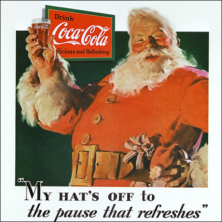 Fig1. Haddon Sundblom. Thirst knows no season (1931) The Coca Cola company. Haddon painted this version for Coca cola every year until 1964 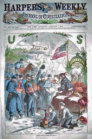 fig 2. Thomas Nast. Santa Claus in camp (1863) Harpers Weekly This was the first depiction of Santa. Nast had him supporting the Union, later clothing him in red. MALE, A. (2015) The power and influence of illustration: A future perspective [online]. Available at: http://repository.falmouth.ac.uk/1580/ [Accessed 8 December 2016] The power and influence of illustration: A future perspective was presented as the keynote address at the CONFIA conference in April 2015, at Falmouth University. Subtitled ‘ How will an increase in multiculturalism, globalization, political and environmental change affect the future needs and expectations for visual communication?’ The paper poses many questions. Male examines the historical tradition of propaganda illustration. He uses even-handed examples from the early 15th century to the present day, and from the East, Middle East and West, concentrating initially on the persuasive and inflammatory power of illustrations, which comment on religion. He uses the feedback from his current undergraduate students to gauge whether attitudes towards propaganda journalism and satire have changed over the last decade. He establishes that propaganda journalism has an impact and uses examples, which include Sue Coe’s work on animal welfare and apartheid, and Thomas Nast’s election winning work for Abraham Lincoln, and his work supporting slave emancipation. He brings the same attention to children’s literature, arguing that it is a particularly potent vehicle for subversive propaganda. The Iranian (Persian) book ‘Little Black Fish’ for example, contains coded symbolism, which was apparently only understood by the revolutionaries who deposed the Shah. In children’s literature, the difference between Eastern European and Western sensibility is noted. Male asks an important question of the audience, about where their own ethical boundaries lie and uses his own practice to draw examples from. These are from the fields of Advertising and Education, the latter, he suggests, is where illustrators must show particular responsibility. These examples are looked at in the light of context and culture. The conclusions drawn are thus: Student evidence suggests that there is less tolerance of explicit, and offensive material, and that illustrators should work within globally accepted ethical guidelines. An awareness of other cultural contexts will be paramount, and should inform sensitivity to diversity and beliefs. The study asks pertinent questions about the global future of illustration, given that we operate in a multi-cultural, multi-faith world. It acknowledges that content can be deemed offensive depending on viewpoint. The examples are drawn from first hand knowledge and from visual communication history. The Coca Cola Company (2012). The true history of Santa Claus.[online].Available at: http://www.coca-colacompany.com/stories/coke-lore-santa-claus [Accessed 10 December 2016] 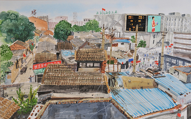 Tim Vyner Hutong, AWRS World Games.2009 MOSZKOWICZ, J. (2012). How philosophical thinking can support the discipline of Illustration. VaroomLab [online] (1) p 45-58. Available at: http://www.varoom-mag.com/?p=4171. (Accessed 10 November 2016).
ZEEGAN, L. (2012). Where is the content, where is the comment? Creative Review [online]. Available at:https://www.creativereview.co.uk/where-is-the-content-where-is-the-comment-2/ [Accessed 5 December 2016] Moszkowicz is a senior Lecturer and Researcher in Visual Communication at Southampton Solent University. Her paper was delivered at the VaroomLab Illustration conference at Plymouth University, September 2012. In her paper, Moszkowicz argues for an explicit philosophical grounding to be embedded within illustration education. The intended audience are educators, particularly within the Art School system. It is written as a response to current thinking that illustration is insular and lacking any critical or perceptive engagement with the wider world (Zeegan 2012) Moszkowicz uses the philosophies of Paul Ricoeur and the work of Tim Vyner and Will Eisner, to draw attention to methodologies, such as phenomenology, which she believes are already implicit in Illustration practice. Moszkowicz broadly explains the methodology of phenomenology and then uses Ricouer’s ideas of mimesis to dissect the work of Vyner. She concludes that by making philosophical study explicit, illustration students will be able to position themselves and their work within wider contexts, and re appraise the role and value of their discipline. This is a useful article, which could encourage, through curriculum development, a deeper understanding of the processes and methodologies of illustration practice, and it’s transformative effect both on the reader and on the creator. 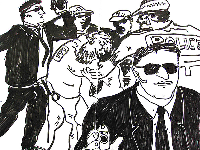 Mario Minchiello; (2007). APEC summit Sydney, Sydney Morning Herald Reportager.org was set up in 2012 by Gary Embury and the University of the West of England, as a response to the lack of illustrated visual journalism. It’s aim is to help launch, support, and show work by visual essayists and reportage illustrators.
Embury’s paper sets out to discover whether there is a growing place for reportage illustration, where it sits compared to a photographic essay, and why there are so few commissions for this type of work. The information has been gathered from interview with practitioners, educators and members of Reportager.org. It concludes that visual journalism has a positive future, particularly with self initiated, authorial work. Examples are drawn from illustrators such as Joe Sacco, Bo Seremsky. Martjane Satrapi, Olivier Kugler and Mitch Miller. The paper addressed the reasons why there is a gap for visual journalism to grow, why it is perfectly placed to fill that gap, and examines the advantages drawing has over photography in this area. There was no evidence from those commissioning illustration, and this would have been a useful and practical addition. EMBURY, G. (2013). The new visual journalism. VaroomLab(1) p 61-70. [online]. Available from: http://www.varoom-mag.com/wp-content/uploads/2013/01/VaroomLab_Journal_IssueOne.pdf [Accessed 20 October 2016] 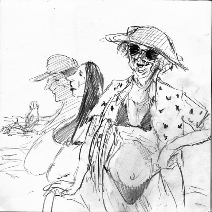 Lois Netter: Long Beach Island New Jersey NETTER, L. (2014) ‘Brief notes on reportage drawing. Visual language and the Creative agenda of the Reportage Artist’. TRACEY, Drawing in situ. (feb 2014)[online]. Available at: http://eprints.port.ac.uk/19890/1/Louis_Netter_TRACEY_Journal_DIS_2014.pdf
[Accessed 16 October 2016]. KRESS,G, and VAN LEEUWEN, T (2006). Reading Images; the Grammar of Visual Design second edition. london, New York. Routledge Lois Netter is a reportage artist, studying for a PhD at Portsmouth University. This paper was published for TRACEY as part of the Drawing and Visualization research programme, Feb 2014. Netter looks at the particular drawing challenges facing a reportage artist and how these require the development of a personal schematic visual language. He explains how the response to the subject is as much about editing and imagination, as about documentation of place and subject. Essential sketchbook drawing as an aide memoire combines with this personal set of symbols to enable the reportage artist to work at speed. Ronald Searle’s Japanese prisoner of war drawings are used as an example. The second part of the paper looks at the communicative value of the sketched line (as opposed to a reworked drawing), and how mistakes, overdrawing and suggestion, engage the viewer. George Grosz and Mario Minchiello are examples. Finally Netter explains the process of composition and compilation of images to make a drawing, and how he uses line quality to imply character. Netter makes valid points about developing a personal language and about the value of drawing constantly in a sketchbook. The paper also poses some important questions for the reader, though not explicitly. Drawing on location requires a memory bank of shorthand symbols, which is definitely improved and enlarged with practice in the field. The skill comes with editing what is seen. Obviously all drawn images are symbols and metaphors for life (Kress and VanLeeuwen 2006 p 8), but there is a difference between re using a shorthand image, and searching for visual language which represents what is before you? Netter states that reportage is as much about invention. How much can you invent before it ceases to be reportage? This book explores the topology of spaces. It examines how spaces are categorized and delineated through sets and sub sets. It begins with a personal space and a bed, then bedroom, apartment, and so on until it mentions the small planet of George Perec, No 2817, named in 1984 (p.96).
Within this written structure are textual stylizations that help describe the concepts; calligrams and taxonomies, stage dialogue, and indexes. This creative and inventive use of form is characteristic of Perec's work. The book is a gift for illustrators and language students, a lesson in lateral thinking about space. There are often playful, practical exercises and suggestions for further thought. I wonder whether Rachel Gannon read the chapter on ‘The Apartment’ (p.26), before embarking on her month long residency at Luton Airport, and indeed Auge, before he wrote about non-places in 1992. PEREC, G. (1974) Species of Spaces. [online]. Penguin. Available from https://monoskop.org/images/b/b0/Perec_Georges_Species_of_Spaces_and_Other_Pieces.pdf. [Accessed: 10/10/2016] ''Chapter 3 Placing Nostalgia: The Process of Returning and Remaking Home By Allison Hui
In Tonya K. Davidson, Ondine Park and Rob Shields (eds.) (2011) Ecologies of Affect: placing nostalgia, desire, and hope (pp. 65-84). Waterloo: Wilfred Laurier University Press This study looks at the relationship nostalgia has with place and time. It looks at the very particular way nostalgia is experienced by expatriates who move away from home and then return. A methodology used is a survey of their travel diaries. The study identifies three components to the generation of nostalgia. It describes a material house/ space, how this becomes a virtual home (when the subject travels away), and finally, it examines the act of 're-placing', when the subject returns. Re-placing means becoming reaquainted with the materiality of the place and adjusting this relationship with the nostalgic memory. Hui suggests that nostalgia is created and nurtured when this space between what is real and what is remembered is experienced. A second method is to use ‘Linked’, an art installation, as a case study to investigate how place, space the real and the virtual, come together. This examines how nostalgic loss is felt both by those who have been displaced, and also by those who have never visited the site before. Hui does clearly point to alternative definitions of space and place by other authors, and so reveals the personal perspective of her theory. This is a key text for the development of my project, dealing as it does with the evolution of virtual place, nostalgia and memory. 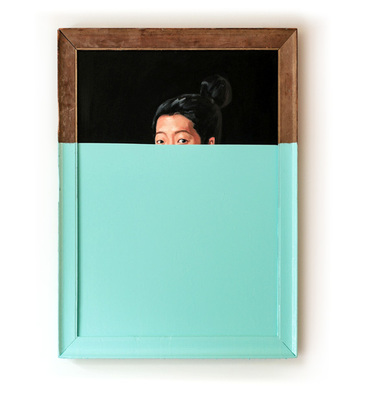 Oliver Jeffers: Oil dipped portrait 2012 BARWICK, T. (2015)’She’s lost control.’ Varoomlab [online] (3)pp.47-55
Available at: http://theaoi.com/varoom-mag/wp-content/uploads/2015/04/VaroomLab-Journal-Issue-3-Interpretation.pdf (Accessed: 18 October 2016) She’s lost control This paper explores the concept of the ‘glitch', and compares digital glitches to mistakes made with traditional tools and methods. It examines how error and chance play a part in the development of a personal visual language, no matter how the images are made. It is a study of Barwicks’ own illustration practice and his methods of choosing materials that give maximum chance of unpredictability. The study also lists other illustrators who work in a similar fashion, with a closer look at the practices of Oliver Jeffers and Ralph Steadman. Forced mistakes and unpredictable outcomes, are the result of control being taken away from the maker (whether by a mathematical programme, or a material process). Successful outcomes also rely on the skill and virtuosity of the creator, and the ability to judge and exploit errors. This idea is extended to other creative fields, and likens an illustrator to a footballer or musician. All play within a set of rules, but play in an intuitive, skillful way to produce a new and exciting experience. This study is relevant to my own practice, which explores chance and error through the use of traditional drawing materials. The extension of this approach, using digital technology is something that I will be exploring in the future. See previous blog post, (16/10/16) ‘The last two months’. 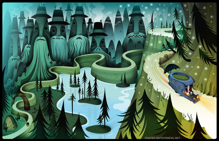 Scary girl, a graphic novel by Nathan Jurevicius Illustrated Worlds: A paper presented by Richard Levesley and Mark Bosward, as part of the Varoomlab symposium ‘Spatialising Illustration’ at Swansea Metropolitan University, Jan 2013. The intended audiences are students, practitioners, researchers and academics. 'Illustrated Worlds' examines how illustrators develop and realize their own authorial voice through the creation of personal worlds, and how the development of this individual visual language contributes to education, to the illustration profession and to commercial success. The authors wrote this in the context of their own practices, both as educators and illustrators and conducted primary research through emailed interviews with a range of professional illustrators. Research also looks at case studies; Graham Rawles ‘Lost Consonents”, Graham Carters multidisciplinary work, and Scary Girl by Nathan Jurevicius. . It is a useful study in that it clarifies how an illustrator uses a personal set of ‘rules’, coupled with symbols and signifiers that resonate with the audience, and which are from real experience, and how these give authority and credibility to an imagined world. From an educational point of view, the idea that self initiated work and commissioned work can have a close and symbiotic relationship, is a positive message, and one which could encourage students to take more risks with their work. It also suggests that this approach engenders greater multi platform and cross-disciplinary opportunities (i.e. animation, interactive media and toys). The interview evidence supports the claim that many art directors do want to buy into an illustrators personal world. However, the study doesn’t fully examine the limitations (if any) that this could bring – typecasting and a narrowing of opportunity for example. Bosward, M. and Levesley, R. (2016) '"Illustrated worlds," VaroomLab, (2), pp.91- 105 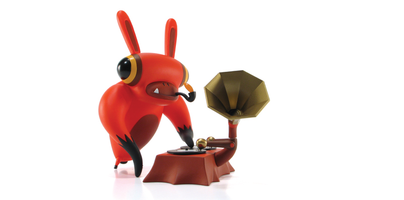 Character toy from Scary Girl by Nathan Jurevicius
|
Archives
August 2020
Categories
All
|
 RSS Feed