|
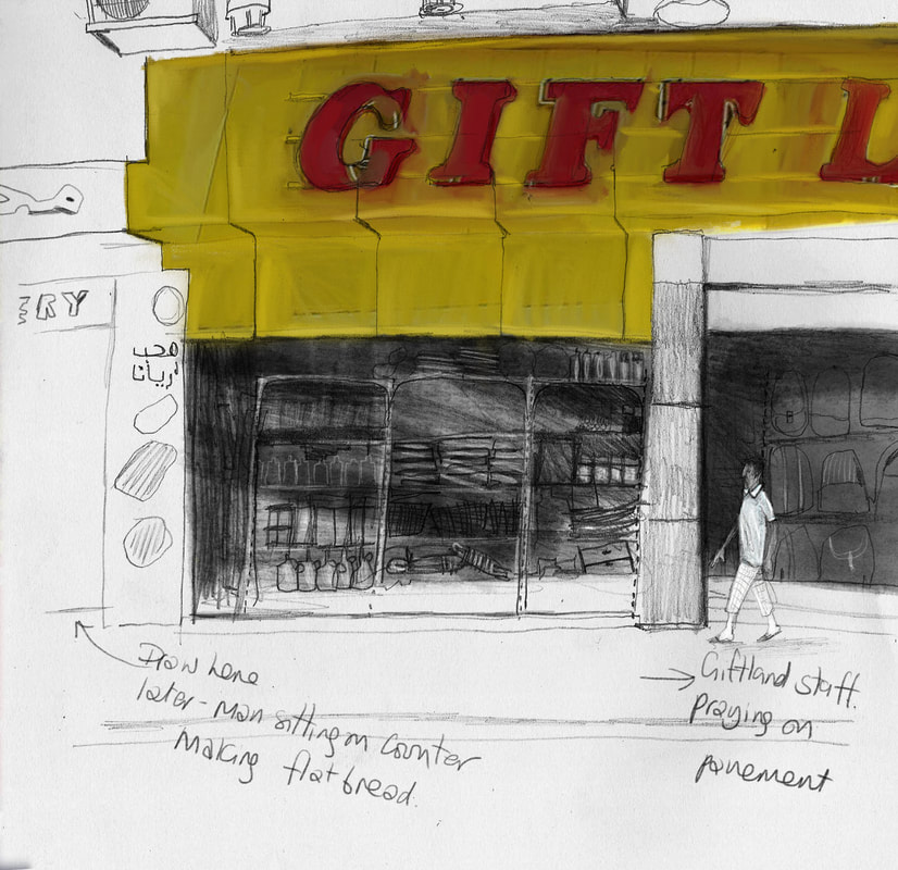
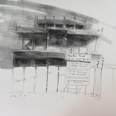
I thought the biggest challenge would be that I can't take photos, but it's not, it's the heat, 38 degrees and the shadows move fast. I noticed the interesting stuff going on either side, whilst drawing -you can't see it. Perhaps I do several drawings at once and have a sketchbook for 'snapshots'? I do think it's nice to know there's life just outside the frame. 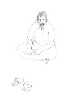 The Flatbread man, just out of the picture. Fig 1: Layout page: Initial ideas from voice recordings. I began with my mindmap, and indentified some possible areas of research. Colour coding was a useful way to link ideas and reading material. I found articles and books on place, placelessness, and non place. I loved the taxonomy in George Perec’s ‘Species of Spaces’ and his book led me to the work of Auge and so to Rachel Gannon. She has a phenomenological approach to drawing space and her project was very much about her relationship with her subjects and the act of drawing. This idea led me to think about the personal relationships that we have with places, and so to memory of place and virtual places. Drawing a memory (and I had established this was to be a collective family memory) needed an approach, which was inclusive of many viewpoints. The methodology therefore needed to gather information from many sources. I identified four main areas of research;
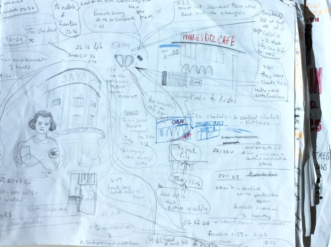
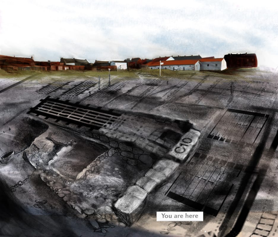
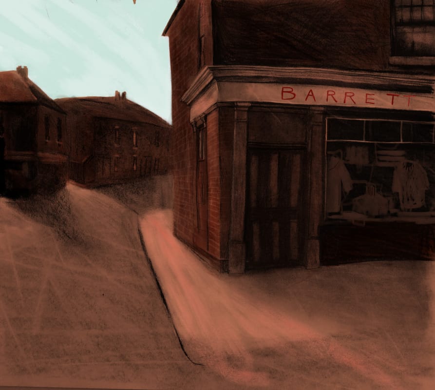
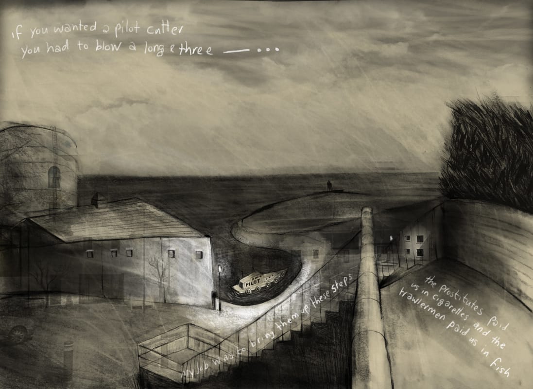
Looking at the subject through different disciplines informed my process. I discovered that some themes were similar, and this validated my approach. I looked at the methodologies of two illustrators, Leah Fusco and Anne Howeson. Both are working with place/time/memory, and both use multiple sources and methods of collecting data, which they then interpret through their creative work. This method really typifies Werner Herzog’s ‘Ecstatic truth’, which is exactly what I wanted for my drawings. I worked out what I wanted to draw in layout pads (fig1) and wrote lots of notes around my drawings. I like to see everything at once and not be precious. The drawings, that I wanted to work on, began as A2 pieces of work, which I photographed before the digital colour was added. Research was a really important part of this project. I recorded interviews and collected stories and anecdotes about the places I drew. I scoured local history websites and family photo albums, and I looked at historical and contemporary maps of the area. I read up on the local history. I had to base the project in fact, and with primary research because my interpretation of it was intentionally incomplete, subjective and disjointed. I enjoyed this part of the project My process seems logical to me. The ideas progressed as I was working, and particularly once I had gathered the interview material. It took a few weeks to begin on the right path, and I suddenly woke in the middle of the night with the idea. This wouldn’t have happened without all the dead ends, reading and drawing that went before. I've learned: Not to worry, if you do the work, you’ll get somewhere! (Some) digital skills To read widely, outside your discipline Thorough research is like having something in front of you to draw - a sound base in fact. That there's an excellent book delivery service in the UAE (Magrudys) if anyone needs to know and that you can sneak into New York University's library! Arbeia Fort: Experiment with maps This image was an early experiment using archaological maps and their labelling. Barrett's: Experiment with analogue nostalgic colour. I sampled colour from damaged old photos and heightened the contrast. The Long and Three: Interview and narrative. I introduced text as part of the image, which told a story about the location.
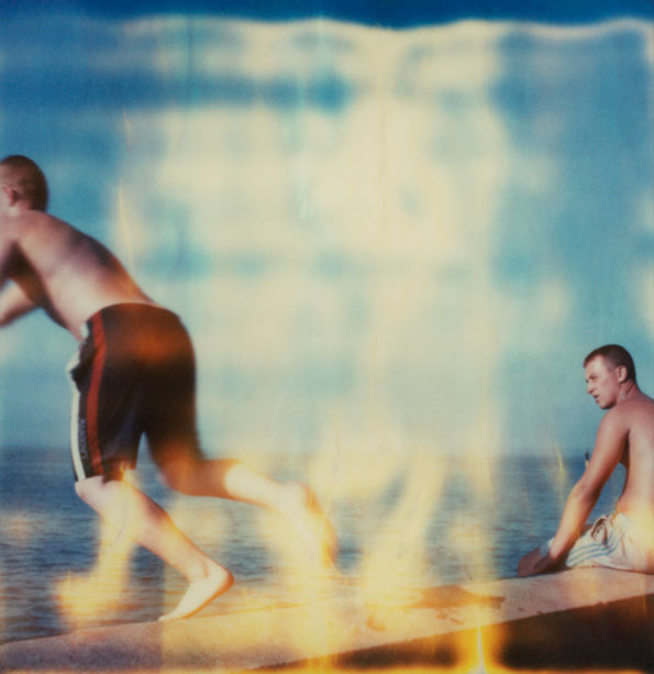
(fig 1) Rhiannon Adam. Dreamlands Wastelands 2014 During my memory of place project, I began to research ways to convey nostalgia. Part of this research took me to the aesthetics of analogue media (notably photographs and home cine film). I wanted to try and identify the colour palettes which conjured up nostalgia, and also discover why this might be so. I looked at my own family photographs and films, and I trawled instagram and pinterest looking for old polaroids and Kodachrome photographs. I found that the colours were a reflection of the chemical deterioration and exposure to light, and that this was dependant on the type of film, how it was processed and how it has been kept. Polaroids are particularly sensitive to light and air pollution, and will crack, fade and discolour (they shouldn’t be stored with other photographs or be exposed to a maximum light of 40 candles!)(Wilker 2004: 5). Photographs can have a yellow/ orange cast, or blue, the colours can fade uniformly or have a high contrast, with some colours more unstable than others. Why are these old photographs so emotive? It’s not just the subject matter, but the materiality of them which is so appealing. Over the last 30 years there has been a massive acceleration in the development of new media technology, and the more this has advanced, the more nostalgia there is for technology of the past (Shrey 2014 p27). It seems that the aesthetic materiality of an old film, record, postcard, is very desirable today. These things show their age, and each time they are used and handled, they decay even more. The marks of deterioration are signs of someone else having appreciated the media. Robnik calls these ‘textual ruins’ (Robnik 2005 p.59), and mimicking a textual ruin is a common enough aesthetic approach (just Google ‘distressed effect’ ). When this is duplicated, it connotes this history, pleasure and connection to the past, when it doesn’t actually exist. Rhiannon Adam is a photographer who explores the aesthetic of deterioration as a symbol of memory and nostalgia for childhood. Rhiannon spent most of her childhood living on a boat at sea. Her photographs in this series 'Dreamlands Wastelands' explore a 'rose tinted' view of a British holiday(fig 1). Colour palettes: Old photographs and postcards In addition to this research, I was also curious about the popularity of Instagram filters, many of which, replicate the 'vintage' aesthetic of old photographs. There are plenty of studies into the subject, Instagram is just one of many apps which aim to recreate analogue film processes, for example Retrocamera, Camerabag,and Hipstamatic. In one such study,' Pictures or it didn't happen', Gant suggests that the addition of an aging filter gives a materiality and authenticity to an otherwise transient collection of data.The idea is that because the faked accidental light leaks and deterioration are not accidental, the subject becomes twofold, the thing that is being photographed, and the photographic process itself (Chopra Gant 2016). He also makes an interesting observation that most social media photographers are younger than the technology they are emulating. He draws the conclusion that real or personal memories aren't the goal, but rather an aura of the past, a general rose tinted, 'wasn't it better then' feeling of the past. CHOPRA GANT, M. (2016). 'Pictures or it didn't happen:Photonostalgia, Iphoneography and the representation of everyday life' Photography and Culture.[online]. Vol 9 (2) p121-133.Available at:
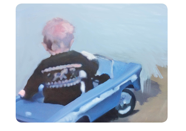
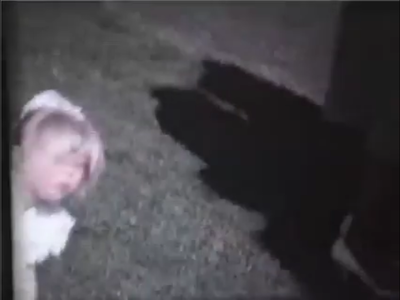
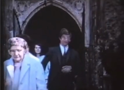
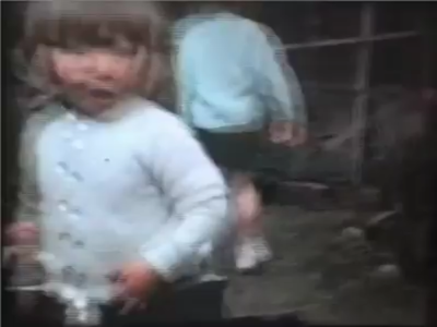
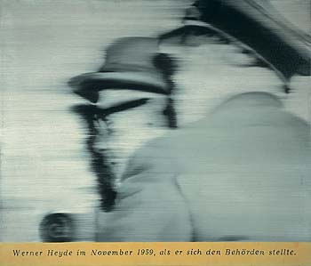
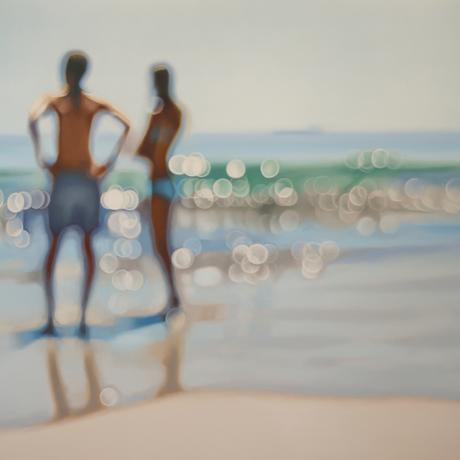
://www.tandfonline.com/doi/full/10.1080/17514517.2016.1203632?scroll=top&needAccess=true [Accessed 8 December 2016] ROBNIK, D. (2005) Mass memories of movies: Cinephilia as norm and narrative in Blockbuster culture. In DE VALK, M. and HAGENER, M (eds). Cinephilia, movies, love and memory ) [online] Amsterdam. Amsterdam University Press. Available at: http://www.oapen.org/search?identifier=340201 [Accessed 8 December 2016] SCHREY, D (2014). Analogue nostalgia and the aesthetics of digital remediation. In: NIEMEYER, K. (Ed). In Media and nostalgia, yearning for the past, present and future. [online]. Available at: https://www.researchgate.net/profile/Dominik_Schrey2/publication/287508471_Analogue_Nostalgia_and_the_Aesthetics_of_Digital_Remediation/links/56775b5a08ae0ad265c5b79d.pdf [Accessed 6 November 2016] WILKER,A (2004). The composition and preservation of instant films [online]. Available at: https://www.ischool.utexas.edu/~cochinea/pdfs/a-wilker-04-instantfilm.pdf {Accessed 7 December 2016] Paul (2016) Oil on board Home movie stills We tend to keep old family photographs, even when they are faded and the chemicals are deteriorating. We keep them if they are a bit blurred or accidently composed and cropped. These qualities are really a metaphor for memory, and I thought it would be an interesting aesthetic to explore. I used an old family film as my resource for a painting of a child in a pedal car, which borrows the pinky, blue colour palette, and then softened the edges to indicate a blur. In later images I emphasised this even more. Many artists are exploring this idea, but the master of blurred painting technique is Gerhardt Richter. In 1973, in an interview with Irmeline Lemeer, he explains: “I've never found anything to be lacking in a blurry canvas. Quite the contrary: you can see many more things in it than in a sharply focused image. A landscape painted with exactness forces you to see a determined number of clearly differentiated trees, while in a blurry canvas you can perceive as many trees as you want. The painting is more open” (Richter, Dietmar, Obrist 2009 p 81) Gerhardt Richter. Herr Heyde (1965). 65 x 55 cm. Private collection A really interesting experiment was undertaken by Korean duo Shin Seung Back and Kim Yong Hun. They developed a software which would scan an entire movie, and every 24 frames, would record an amalgum of all found faces. The resulting prints offer a visual mood and a memory of time spent. It's worth looking at the whole series which includes films such as Amelie, Old Boy and Black Swan. Shinseung Kimyonghun Avatar Portrait (2013) Pigment inkjet print.Variable dimensions An alternative way to look at blur and memory can be seen in the 'Sea' paintings of Phillip Barlow. They are reminiscent of an overexposed holiday snap, taken from the wrong angle. He uses blur to describe a saturation of light with a high tonal contrast. Just the kind of image that occurs when the sun is behind the subject. Phillip Barlow. Glassy (date unknown) Oil on canvas. 1.2 x 1.8 m MCARTHY, T. (2011) Blurred Visionary: Gerhardt Richter’s photo-paintings. The Guardian.[online] Available at: https://www.theguardian.com/artanddesign/2011/sep/22/gerhard-richter-tate-retrospective-panorama
[Accessed 5 December 2016] RICHTER, G. DIETMAR, E. and OBRIST, H. (2009). Gerhardt Richter: Texts, writings, interviews and letters 1961-2007 Thames and Hudson. London.
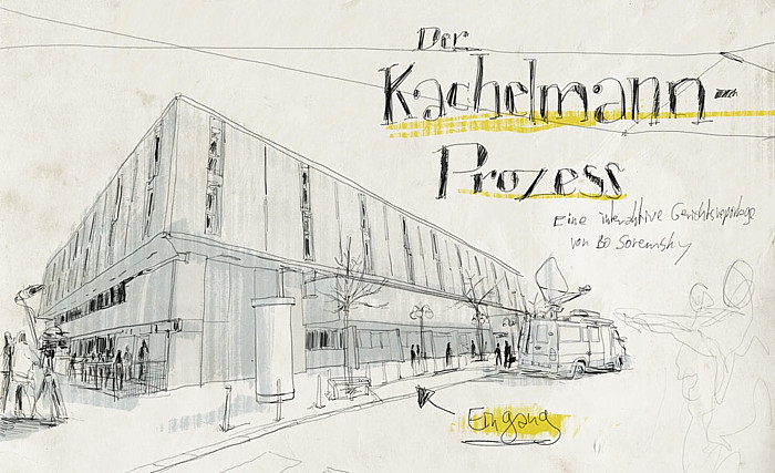
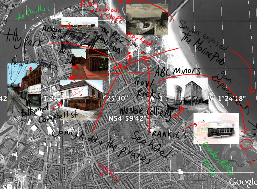
Bo Soremsky and Der Kachelmann-Prozess Bo Soremsky is a Berlin based reportage artist. His recent Masters thesis looks at future possibilities in reportage drawing, in particular focusing on interactivity and non-linear narrative. Jorg Kachelmann is a popular weatherman, and involved in a legal trial. Der Kachelmann –prozess, is Soremsky’s method of recording this trial as a reportage artist. During the trial Soremsky drew as much as he was allowed, some information he had to retrieve from newspaper reports, witness statements and visits to relevant places, as the courtroom was closed to him. Gathering information in this way, from various sources led him to the conclusion that a non-linear, interactive resource was the most comprehensive way to document the trial. Viewers can select the participants, read their testimonies, and compare the available facts (and fictions). It is subjective and reflects in a way, how a judge would hear evidence. Digital technology is a perfect vehicle for reportage illustration. Drawings offer an emotive and experiential account of events and can emphasise and comment as well as document. In addition, sound, animation, photography, maps and text can complement the information. A nonlinear reading allows for multiple stories and relationships to become clearer. Part of my research into a narrative of South Shields has resulted in bringing together stories (audio), maps and illustrations to ‘place’ the narrative in specific locations and give an overview of their relationships to each other. This approach has much potential for future projects. Reportager (2012) ‘Reportager’: Projects: Bo Soremsky: ‘Passengers’ and ‘der Kachelmann-Prozess’: Research group and Programme at the school of creative arts, university of the west of England.[online] Available from: http://reportager.uwe.ac.uk/projects12/soremsky/kachelmann.htm [Accessed: 8 November 2016]. Experimental map of South Shields; 2016, I thought about linking the drawings and stories in a similar way.
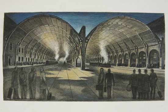
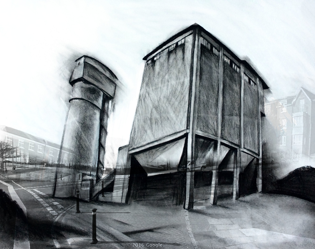
Anne Howeson, Kings Cross Railway shed, 2015 Exhibition: Present and the Past: Renovation and revival in Kings Cross Central. 40 Cross Street, Islington. 16th September-1st October 2015. Kings Cross/ St Pancreas was the biggest area of urban regeneration in Europe when Anne Howeson was commissioned to make a series of drawings commenting on the changes. To illustrate the history and the passing of time, Anne used archival prints of the area, which came from The Foundling Museum, The London Metropolitan archives and the Museum of London. She incorporated them into her work by manipulating their content through drawing and erasure. They became palimpsests, which explore memory, fiction and documentary (Howeson 2015) In an interview which she gave to the online Design show, ‘Section D’, she discussed why and how she made the work. Anne has always explored the idea of place in her work, and as a local to Kings Cross, wanted to record some of the transition in the area. She was invited to use the archival prints following an exhibition at the Guardian. She began each drawing with the print as a starting point, and explained how this was like having a conversation with the artist. The work has a strong narrative, and as she rubbed out and added her own interpretation, she imagined what could have been there. She mentions passages in Dickens, where he describes dust heaps, and so she draws these in. It’s unclear what is fact and what is fiction. She talks about the work being a palimpsest, not only of physical layering, but in a historical sense. She also talks about "strange repeated moments" (Section D 2015), and compares the outrage at the opening of a new line in 1850, to the Crossrail protests today. Cath Donaldson,Westoe Colliery, work in progress, October 2016, digital and conte/ charcoal. In my project research, I have been looking at the depiction and recollection of place, in memory and history. I began with my childhood homes, and earliest recollections of South Shields where I lived until I was three. A central memory is one of the smells of coal and of the sea. The coal mine closed in 1993.
To try and illustrate this I experimented with drawing and google maps, drawing a blackened coalmine, collaged with the mock Georgian, mass-designed housing estate that has been built on the site. To suggest the industrial, vital nature of the mine, I used aggressive mark making and tonal contrast. By comparison, there is a uniform blandness to the new build. This is a very early experiment, and the only visually pleasing part of the image is the foreground, however I do think the idea has potential for development. ANNE HOWESON (2015) Imagining Kings Cross solo show [online] Available at http://www.annehoweson.com/current-work/ [accessed October 20th 2016] SECTION D (10/02/2015) From South Korea to Kings Cross [online] Available at https://monocle.com/radio/shows/section-d/174/ [accessed October 20th 2016] Howeson interview from 18.58-28-33 minutes 'What am I doing in my work? that's has been a tough question these last months, given that the reason for the MA is to explore new visual languages and ways of working. This summer I have spent drawing, that is how I make images for the most part. I don't often work digitally, preferring the tactile pull of chalk/ pencil on paper. I am aware of the limitations of my 'usual' medium - pastel, chalk, pencil; you have to work big, it's tricky to scan, it smudges easily, but it is good for 'on the spot' drawing. Recently, and in preparation for the MA, I started using other mediums, a Wacom tablet, coloured pencil, collage, in a bid to extend my visual language and to better describe my intentions. Movement, controlled accidents, and layering are typical of the way I have been drawing. There are a few reasons for this. Firstly, I draw a lot in my sketchbook. The pencil line is searching (not always 'correct'), but it does wander over the subject, and tries to express form and emotion or character. This quality, gives a truth and immediacy to the drawing, and it's a quality which I try and capture in my illustrations. This doesn't feel like an aquired 'style', because it's come from a lot of observational drawing. It is more a shorthand visual language that has developed as a way of working over a long period of time. Louis Netter, a reportage artist who is currently studying for a PhD/MPhil at the Royal College has written about his illlustration practicehas said that "drawing from life is a process of invention and modification of drawn marks that collectively imbue the work with an individual voice" (Netter, L. 2014). Some of my work, particularly the buildings, start with a chaos of marks, or an underpainting of colour which has an engineered randomness. I'll then pull together detail, and emphasise some of the accidents. It is a technique that works well with the medium. My first degree was in Graphic Design, and my tutor was Terry Dowling. Varoom claimed him as a founding father of radical contemporary illustration (Shaughnessy, A.(2007),'Abusing the Process', Varoom (5) pp 72-85. He introduced me to illustrators like Sue Coe, Anne Howeson, Chloe Cheese, and animators the Quay brothers (who came and taught a bit of animation). George Grosz was another influence.
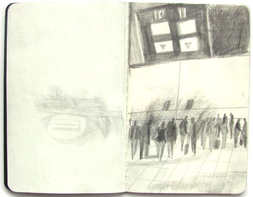
NETTER, L. (2014) Drawing and Visualisation research: Brief notes on reportage drawing, visual language and the creative agenda of the artist.[online]. Available at: http://eprints.port.ac.uk/19890/1/Louis_Netter_TRACEY_Journal_DIS_2014.pdf (Accessed: 16 October 2016). Shaughnessy, A.(2007), 'Abusing the process' Varoom, 5 pp72-85 For this project, I am investigating the idea of ‘place’. To help clarify ideas, it seemed obvious to begin by drawing the place I’m in, and through these drawings, investigate some of the different kinds of ‘places’ that exist. If the end product is an illustration, then it makes sense to think through drawing. I decided to begin this way after reading Rachel Gannon’s paper ‘Being there, conversational drawing in a non-place” (Gannon, 2013, pp. 68-77) The ‘Non-place’ project began as a month long residency at Luton Airport in August 1995. The brief was to record and document the space, travellers and staff as they went about their business, and to end with an exhibition at the airport. The drawings came from an initial interest in documentary, but during the process, the focus became one of the experience of drawing, and the experience of ‘drawing as thinking, not thought’ (Gannon 2013,p.69). She uses the dictionary definition of ‘drawn’, being drawn into a conversation, as a description of the way she works, ‘not a conversation with someone I know but with a stranger. Someone I am struggling to get to know, searching for common ground (Gannon 2013,p.72). I visit the local shopping Mall to make some drawings. It’s a good example of a non-place (Auge, 1995), and is full of people passing through, passing time, and waiting. Also, like the airport, Photography is forbidden (also so is drawing, but I find that out later). Drawing from life, gives a first hand account of the place. It is time based, so I’m recording 5 seconds -5 minutes in the lives of other people. Most of them are waiting for about the same length of time. Rachel refers to Berger’s idea that ‘photography stops time, whilst drawing encompasses it’. Drawings that take longer than the moment witnessed, are more a product of memory. (Gannon 2013,p.73). I only draw while they are in front of me. I prefer to draw from life. Photographic reference is often necessary when making an illustration, but if it’s possible I’ll always to try to collect reference for drawings from observation. It is easier to filter out unnecessary information, and to select at that point what the emphasis is going to be. I can take what I need and supplement later with a photo. I am also making notes for my blog so my written recording is simultaneous with the visual.
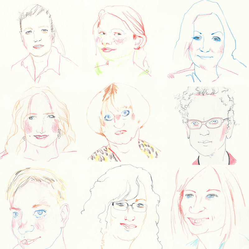
I began as an observer, not in their ‘place’. However, once, eye contact and occasionally, conversation has begun, my relationship changes with them and their place. Have I broken my own 4th wall? I am aware that I don’t want to change the relationship of observer and observed and that this affects whom I choose as subject. For example, singles and couples are usually absorbed in themselves and each other, whereas someone in a larger group will often disengage and also become an observer (and watch me). Perhaps this is what Rachel means when she writes about Fabians ‘denial of coevalness’ (Gannon, 2013 p73). His notion is that in the field of anthropology, there is a contradiction between people viewed as contemporaries and in dialogue, and those that are seen as ‘other’ and separate – and not inhabiting the same time and space as the observer. To try and understand this (and test myself), I drew a lot closer than I normally would and stood in clear view. All but two subjects were aware I was drawing them, three smiled (two at me, one to themselves, one got annoyed I think) and the rest ignored me. They all carried on as if I wasn’t there, and didn’t appear to modify their behaviour in any way. My conclusion is that there are two ways to approach on site drawing. Eiither dive in, become involved and be part of the event, or be a detached observer, collecting information. If I have permission to draw, then the first approach will yield the most information, but it needs more courage. Gannon, R. (2013) ‘Being there: Conversational drawing in a non-place’, VAroomLab, (2). Auge, M. translated by John Howe (1995),’Non-places: Introduction to an anthropology of Supermodernity’, Verso, London New York All of these women have the same name as me. One of them describes herself as a lovable bitch, another is a UK Lecturer, a lifestyle writer, a graphic designer, a round the world sailor, a film maker, a woman who sells islands, an executive coach, and a lawyer who 'knows her way round a kitchen'.
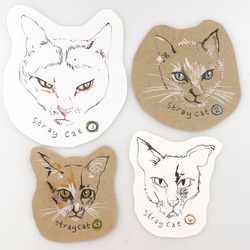
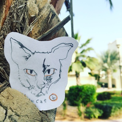
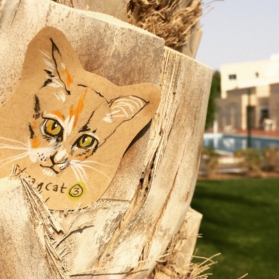
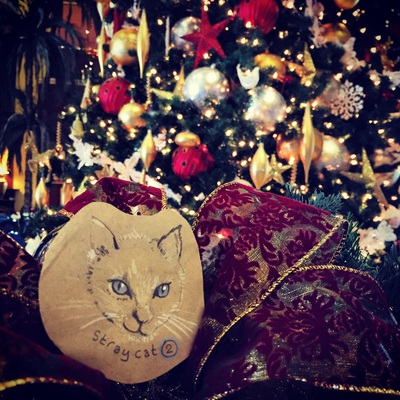
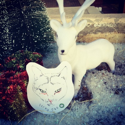
This set of drawings was originally insired by Toronto based artist Amanda Happe (accent on the last e). In the book 'Creative UNblock', she wrote, “I challenge you to make something and leave it somewhere public — somewhere it might be found. Something not too grand or careful, but honest and perhaps lovely. When you’re creating it, think about one person happening upon it. Make them a message. If you enjoy this feeling of caring about something without feeling precious about it, do it again. And again.” There's a stray cat that sits under my car every morning. He sees off the others, who all have their own bit of territory. If I leave the front door open too long, he thinks he's welcome. We all know these cats, and usually ignore them. I decided to draw their portraits and leave them around the place we live. I wanted to celebrate their individual character and (perhaps) encourage others to give them a bit of thought. and here's where I put them....... and on the back...'please look after me'. They all went within the hour, so I think I'll do some more.
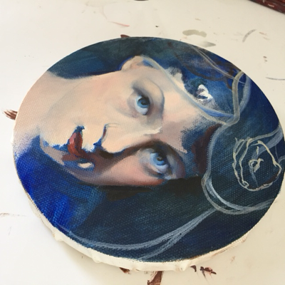
These two are the latest additions to my 'circus of the magnificent' series. it's a very loose title for a bunch of drawings and paintings about people with unique talents. The narrative that has built up, and which connects all these performers is as important as realising the portraits. I haven't discovered the identity of the snake charmer (if that's what she is), but I know she is reclusive, elusive and shy. The other character is much more worldly, and is the sister of the underwater acrobat. She also looks after the costumes.
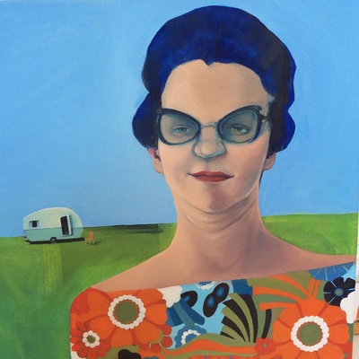
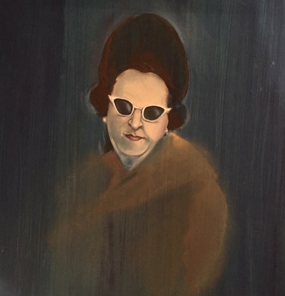
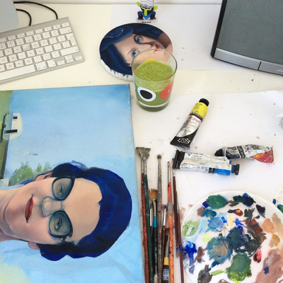
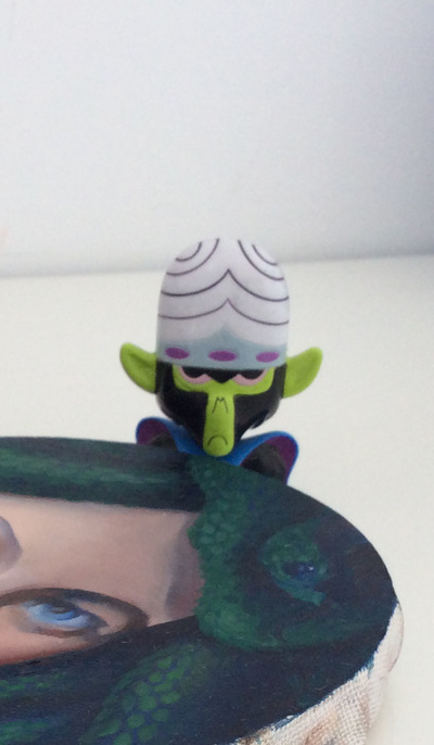
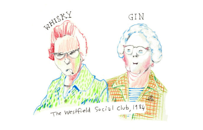
I'm trying a technique which came about by accident ( as often happens for the best), and am keeping the ghost of a terrible painting that was originally started. Now I know this, next time I' ll plan this in. I like the history, random marks and extra information this gives......and that's Mojo Jojo in the background...... Whenever I get stuck with my work, or as is the case today, I'm stuck and waiting for paint to dry, it's very good to keep drawing - anything at all. This was inspired by a word prompt from the 'Illustration Friday' challenge. The word this week is 'Nostalgia'. I have two reasons to do this.... I've a giant box of new coloured pencils I want to try (so not how I normally work), and the last two paintings have been in oil, so I want something fast - I'm taking a big step outside my comfort zone. These two ladies are regulars at the Westfield social club and this is their story..... http://illustrationfriday.com/ The Westfield is a working mens club in Newcastle. If you go with these old ladies, you don't buy a drink at the bar because they each carry a different spirit in their handbags (which are on their knees under the table). They've had a drink and are waiting for the meat raffle to be called.
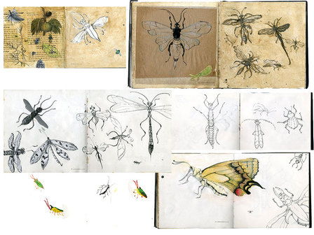
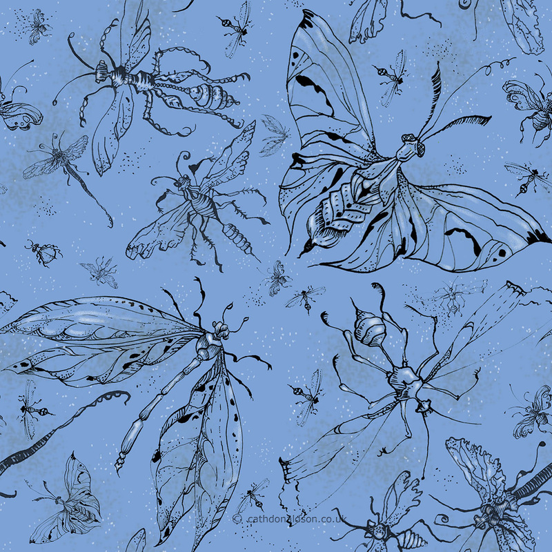
My nightbug pattern was inspired by a visit to the Insect and butterfly house at London zoo. I hate insects and spiders and I've never been able to go into the bug houses without my eyes closed for much of the time (walking in the middle). My idea was to try and draw some of them, objectifying them as beautiful delicate specimens (not fast winged predators intent on flying into my hair). I used dip pen and ink for most of the drawings plus a yellow ochre wash mixed with a bit of PVA. I tried drawing on parcel paper and the pages of an old book too.
I looked too at victorian encyclopaedias, and fell in love with the etchings in the 1851 'Iconographic encyclopaedia of science, literature and Art'. Quite excited to see this printed. I'm just waiting on the swatches to check the colours are ok. When it's done, it can be bought from my Spoonflower shop (or click on the link in my portfolio) in grey and blue.
I've been on a huge learning curve this summer with both creativelive and the ladies from Moyo magazine, though the deadlines have been tough, and the hours long. I've met a supportive bunch of designers who have kept up the criticism throughout (it's like being back at college). I'm going to share some of my process here over the next few days because I want to keep a record of how its going, and it's always good to see where things come from. |
Archives
August 2020
Categories
All
|


 RSS Feed