|
" fieldwork notebooks produce a knowing that is largely the result of stories and chance embedded in what could be called 'the stranger effect', whereby the anthropologist observer is credited with mysterious power no less than with childlike ignorance and vulnerability"
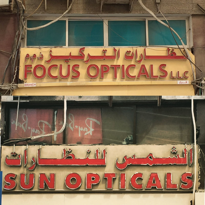
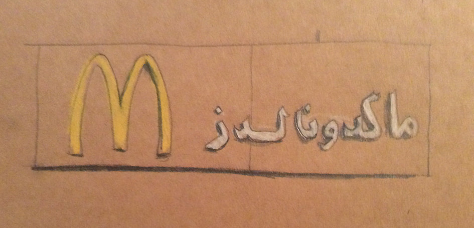
Michael Taussig (2011) I swear I saw this: Drawings in fieldwork notebooks. page 144 Shop signage in Hamdan Street, Abu Dhabi In 2013, the government set a standard for all the shop signs in the city. The aim - to make the city more beautiful. Signs aren't allowed to conflict with the architecture of the building. Signs aren't allowed to cover integral architectural features, or carry too much information, and all of them have to be 3D. Signage regulations source " A town is no longer a series of fixed perspective views, but is abstract sculpture"
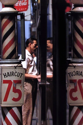
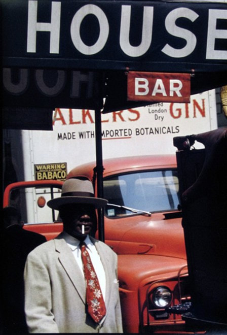
Robert Weaver, The Vogelman diary, 1982 Saul Leiter, Haircut, 1956 Saul Leiter, Harlem, 1960 Saul Leiter, To all Trains, date unknown
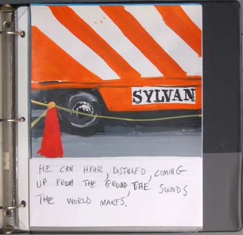
All Images: Howard Greenberg collection. http://www.howardgreenberg.com/artists/saul-leiter Robert Weaver, A pedestrian view, the Vogelman diary, 1982 'A pedestrian view is full of metaphor. Celebrated 18th century flaneur, Edward Cave always signed himself as 'Sylvanns Urban', - 'the urban jungle' in his work for 'The Gentleman's magazine'.Multiple stories are told through the equal partnership of text/image/text.
Image: Robert Weaver, A pedestrian view, 1982. The Robert Weaver Estate "the casual eradication of distinctive places and the deliberate making of standardized landscapes and the weakening of the identity of places to the point where they both look alike and offer the same bland possibilities for experience"
E. Relph Monthly archives January 2016: http://www.placeness.com/2016/01/ Old Abu Dhabi "The emphasis on courtyard in Islamic architecture gave it the name of the "architecture of the veil', because it focuses on the inner spaces (courtyards and rooms) which are not visible from the outside. Courtyard housing is an architectural device with a long history first appearing in the buildings of Syria and Iraq three millennia ago. Arab nomads first made use of the concept of a courtyard during their travels and stay in the desert.They set up their tents around a central space, which provided shelter and security to their cattle." Mahmoud Zein Alabidin Image: Old Abu Dhabi http://www.abudhabi2.com/history/ I am going to use this space for anything I find interesting whilst researching my major project.
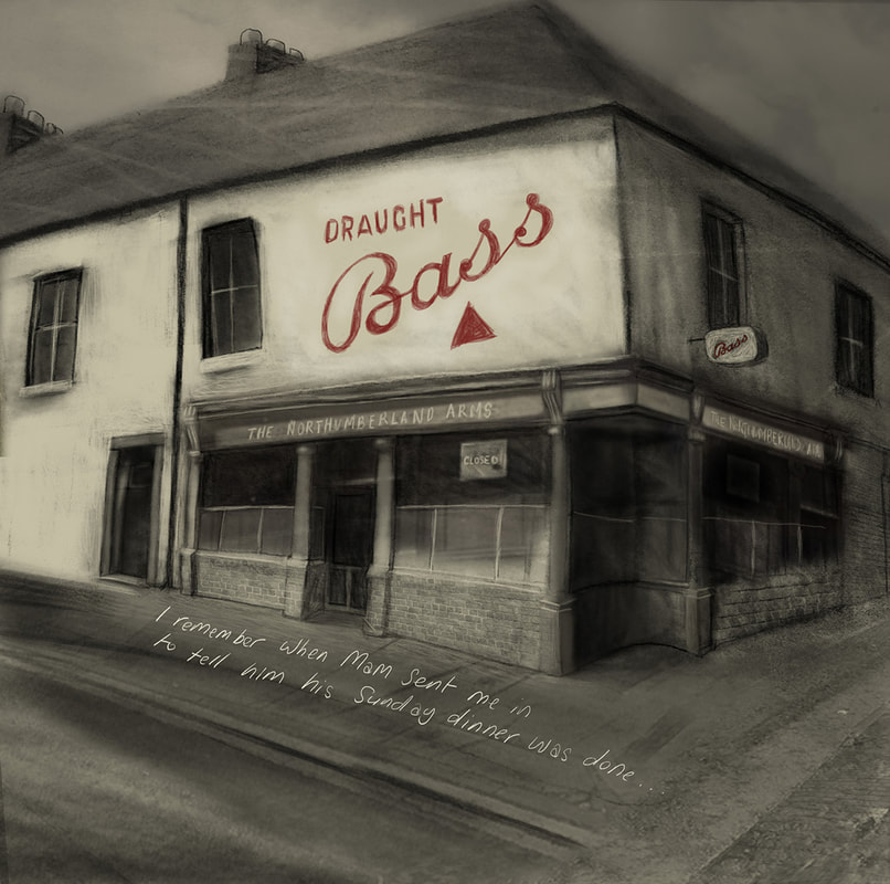
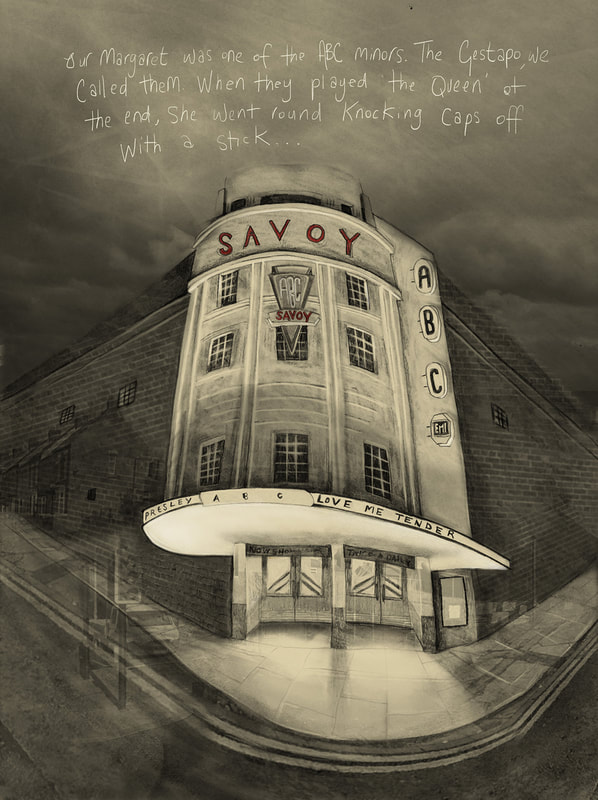
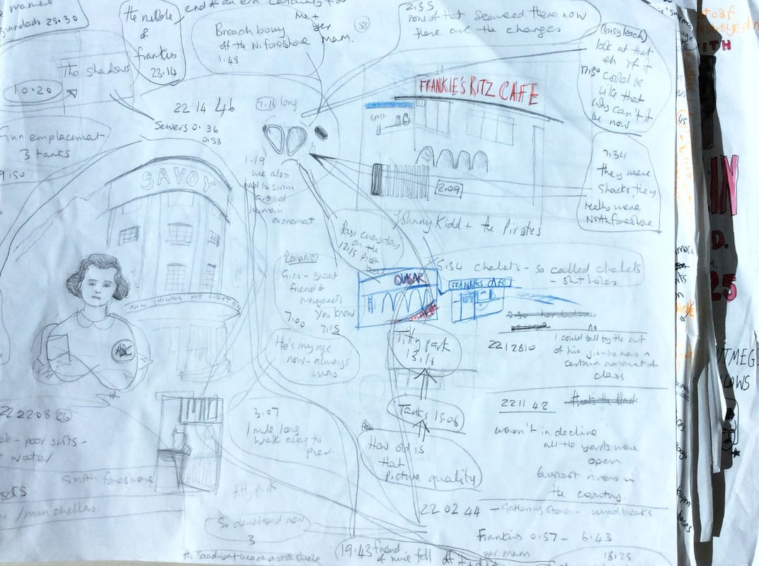
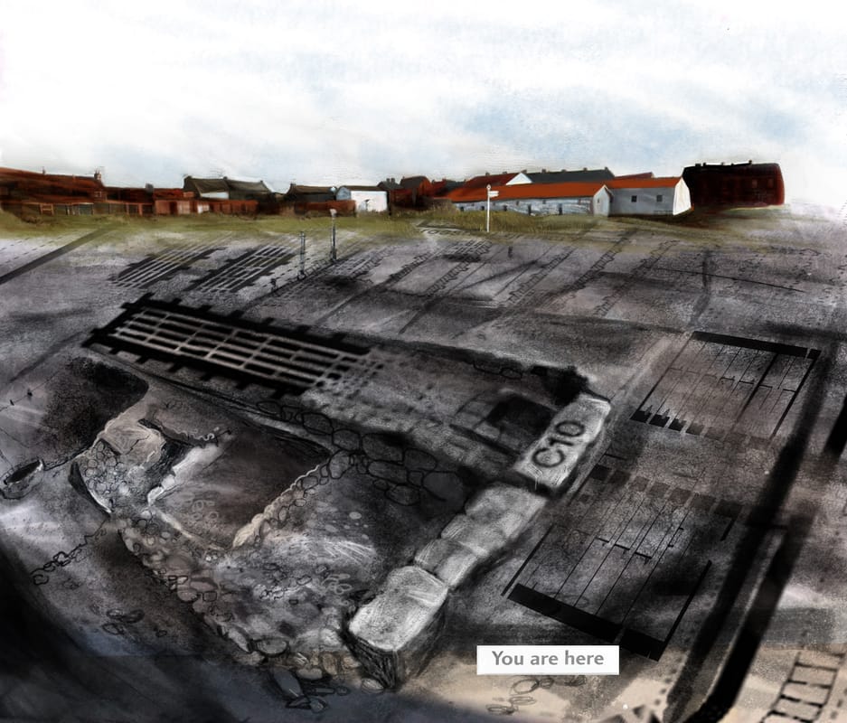
I'm very happy to say that two of my illustrations have been shortlisted for the Cheltenham Illustration Award 2017. The subject this year is 'Tales through other's eyes'. My illustrations are about memory of lost places, and I interviewed my Dad and others about growing up in South Shields. The images are of places which don't exist any more except in memory.
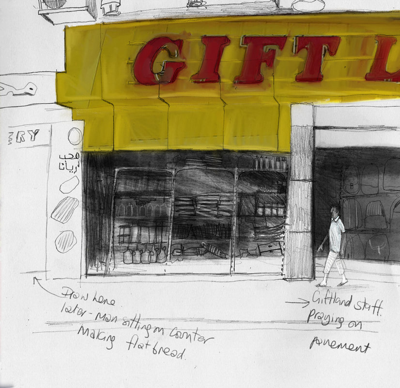
I thought the biggest challenge would be that I can't take photos, but it's not, it's the heat, 38 degrees and the shadows move fast. I noticed the interesting stuff going on either side, whilst drawing -you can't see it. Perhaps I do several drawings at once and have a sketchbook for 'snapshots'? I do think it's nice to know there's life just outside the frame. 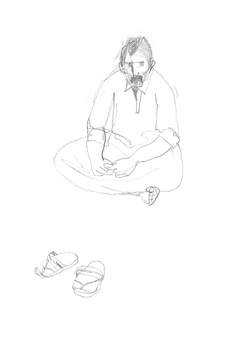 The Flatbread man, just out of the picture. Lots of questions
How are spaces documented? What is the difference between space and place? What information do I want to record? What are the methodologies to use? Will the experience of drawing dictate the methodology? Why choose Abu Dhabi as a subject? What is the aim of this project? How will it be realised? Who is it for? What use will it be? How to begin? MA Illustration online University of Hertfordshire Research and Enquiry Module 7WCT0001 “There is such a thing as poetic, ecstatic truth. It is mysterious and elusive, and can be reached only through fabrication and imagination and stylization”(Hertzog in Ebert 1999). I have chosen ‘Place’ because of my interest in reportage and documentary drawing, and also because it is broad enough to describe community, history, imaginary, virtual and factual places. I want to explore the area of documentary fiction, and am inspired by Werner Herzog’s Minnesota declaration about poetic truth. I am interested in the way an illustrator can begin with a real place or situation and communicate a ‘truth’ through imagination, stylization, and selection. I have also included some relevant posts to my role in education. EBERT, R. (1999) Herzog’s Minnesota declaration: Defining ‘ecstatic truth’ | Roger Ebert’s journal. [online]. Available at: http://www.rogerebert.com/rogers-journal/herzogs-minnesota-declaration-defining-ecstatic-truth [Accessed: 2 October 2016]. Draw Duke Street: Illustrating space as collaborative, socially engaged practice. M. Miller17/12/2016
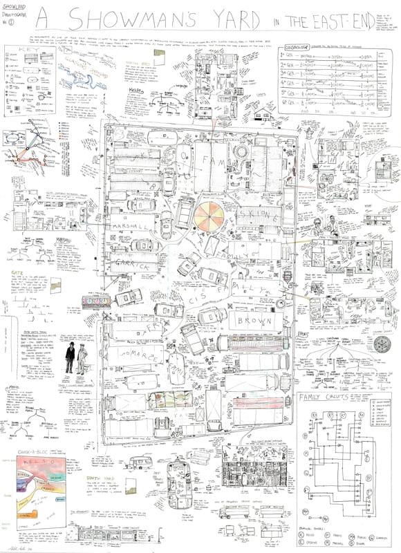
Mitch Miller: Showman's yard (2012) MILLER, M. (2013). Illustrating space as collaborative, socially engaged practice: The first report from the DRAW DUKE STREET residency. VaroomLab (2) p 24-40 Mitch Miller is a PhD student at Glasgow School of Art, and an illustrator. His paper’ draw Duke Street’ was presented as part of the VaroomLab symposium, ‘Spacialising Illustration’ in January 2013. The intended audience are students, illustrators, academics and the residents of Duke Street. The Draw Duke Street project is a socially engaged documentary drawing project, set in an underprivileged area of Glasgow. This paper is a report on the processes involved and to test and develop a methodology. Can a ‘Dialectogram’ fit a socially engaged model of work? A Dialectogram (a term coined by Miller) is a combination of plan, diagram, text and drawings, Miller has a background in social anthropology and identifies himself as an ethnographer. He chooses subjects that are commonly overlooked, misunderstood or are in an area undergoing change.The Duke Street residents are a carnival community. Draw Duke Street is a collaborative project where the subjects themselves generate the content; a mix of stories, memories and fact, which can take weeks and months to collect. The multimodal use of text and image is not explicitly mentioned, but the text is used for documentary detail and authenticity (over 30 hours of interviews were conducted). Miller describes the work of the Reportager group, and Olivier Kugler, Julien Malland and Joe Sacco, as also working in an ethnographic tradition. Miller also candidly documents the many problems associated with public collaboration. He reaches the conclusion that awareness of the area was raised despite the impossible deadline, and despite the difficulty of working with the input of so many people, and with so much information. It was also a successful test of the methodology and helped him to prepare for his subsequent case test in Govan, Glasgow. The paper is useful in that it clearly documents problems associated with collaborative work, and offers suggestions for improvement. It sets out a clear methodology and is honest about the potential and real pitfalls. In my own project, I am gathering personal testimonies and narratives through interview so Miller’s methodology is relevant to the work I am doing. He has also gathered his information- a mix of fact and fiction, from multiple sources and used text, drawing, data and diagram to communicate the whole picture. MILLER, M. (2013) Glasgow dialectograms, drawing a disappearing city. [online]
Available at: https://dialectogram.wordpress.com/ [Accessed 17 December 2016] Fig 1: Layout page: Initial ideas from voice recordings. I began with my mindmap, and indentified some possible areas of research. Colour coding was a useful way to link ideas and reading material. I found articles and books on place, placelessness, and non place. I loved the taxonomy in George Perec’s ‘Species of Spaces’ and his book led me to the work of Auge and so to Rachel Gannon. She has a phenomenological approach to drawing space and her project was very much about her relationship with her subjects and the act of drawing. This idea led me to think about the personal relationships that we have with places, and so to memory of place and virtual places. Drawing a memory (and I had established this was to be a collective family memory) needed an approach, which was inclusive of many viewpoints. The methodology therefore needed to gather information from many sources. I identified four main areas of research;
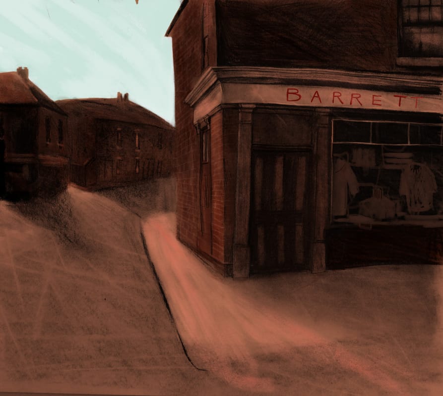
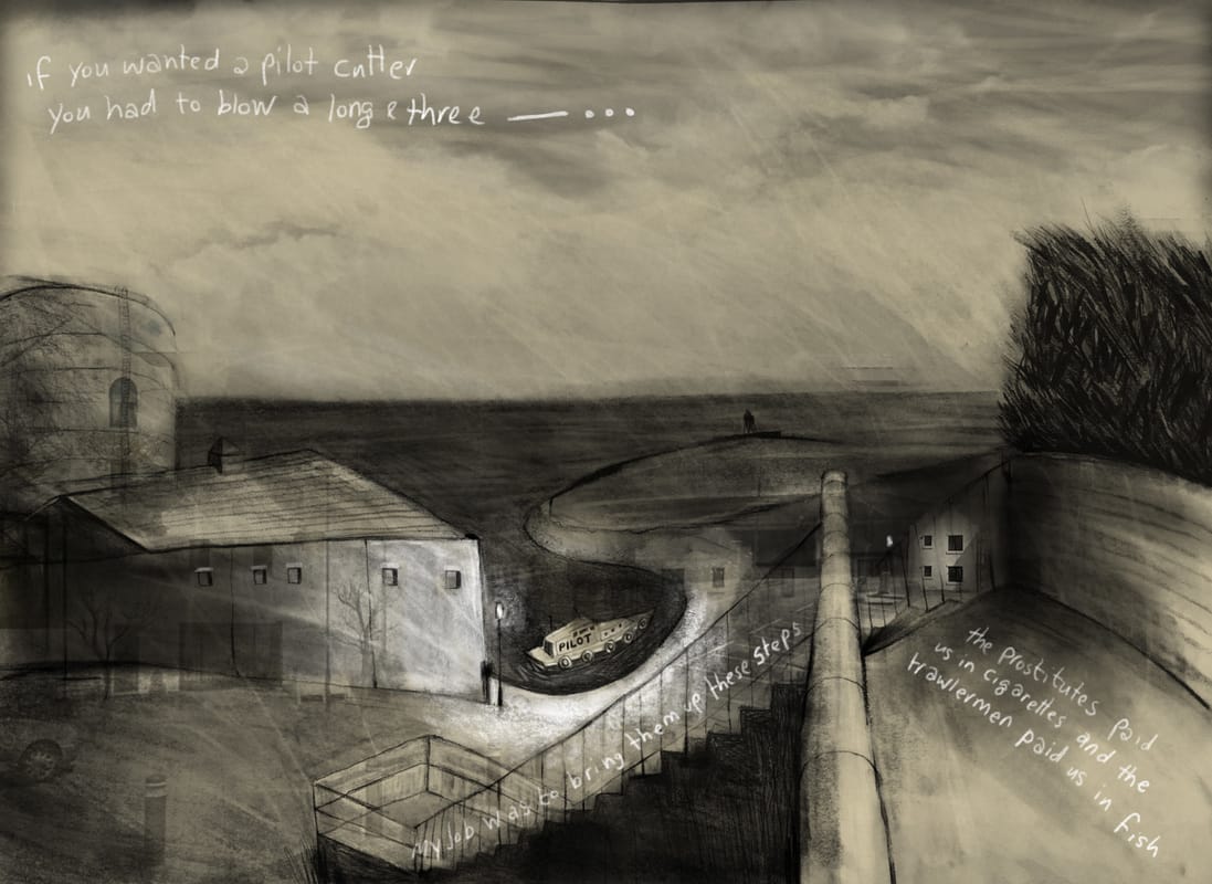
Looking at the subject through different disciplines informed my process. I discovered that some themes were similar, and this validated my approach. I looked at the methodologies of two illustrators, Leah Fusco and Anne Howeson. Both are working with place/time/memory, and both use multiple sources and methods of collecting data, which they then interpret through their creative work. This method really typifies Werner Herzog’s ‘Ecstatic truth’, which is exactly what I wanted for my drawings. I worked out what I wanted to draw in layout pads (fig1) and wrote lots of notes around my drawings. I like to see everything at once and not be precious. The drawings, that I wanted to work on, began as A2 pieces of work, which I photographed before the digital colour was added. Research was a really important part of this project. I recorded interviews and collected stories and anecdotes about the places I drew. I scoured local history websites and family photo albums, and I looked at historical and contemporary maps of the area. I read up on the local history. I had to base the project in fact, and with primary research because my interpretation of it was intentionally incomplete, subjective and disjointed. I enjoyed this part of the project My process seems logical to me. The ideas progressed as I was working, and particularly once I had gathered the interview material. It took a few weeks to begin on the right path, and I suddenly woke in the middle of the night with the idea. This wouldn’t have happened without all the dead ends, reading and drawing that went before. I've learned: Not to worry, if you do the work, you’ll get somewhere! (Some) digital skills To read widely, outside your discipline Thorough research is like having something in front of you to draw - a sound base in fact. That there's an excellent book delivery service in the UAE (Magrudys) if anyone needs to know and that you can sneak into New York University's library! Arbeia Fort: Experiment with maps This image was an early experiment using archaological maps and their labelling. Barrett's: Experiment with analogue nostalgic colour. I sampled colour from damaged old photos and heightened the contrast. The Long and Three: Interview and narrative. I introduced text as part of the image, which told a story about the location.
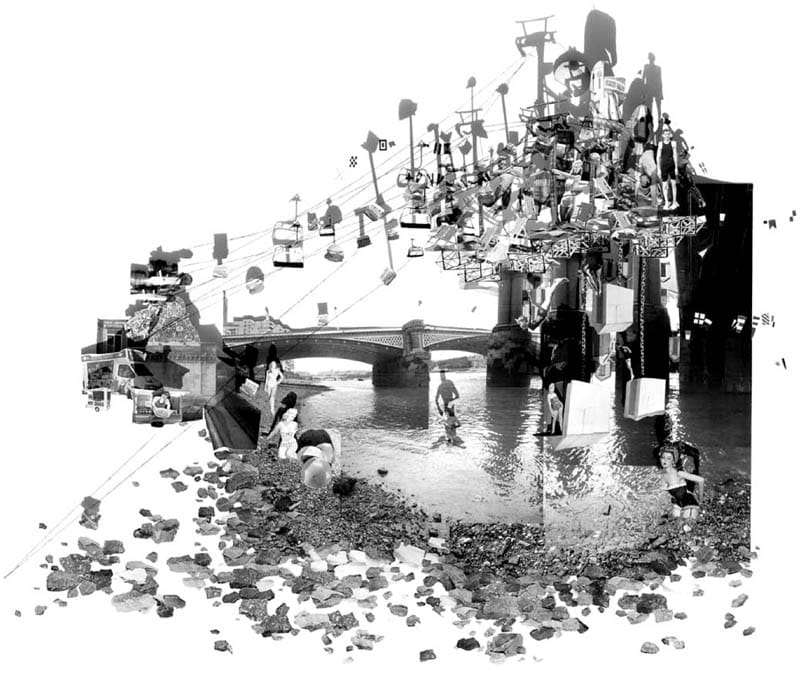
Fig 1: C. Lim, M, Mutanda,T. Marchewka: Discontinuous cities (2007) Collage C J Lim is the founder of Studio 8 Architects and Professor of Architecture at the Bartlett UCL. Lim created Short Stories as an alternative way to communicate the complexity and narratives within city spaces. Lim uses fairy tales and myth as his inspiration, and invents architectural scenarios which meld narrative and place together (fig 1). It’s an ambitious and creative way to think about where we live, and it ties in with the history, and fiction of the city. Architects traditionally use plans, diagrammatic visuals, and slick computer generated images to project future invention, but not everyone can read a plan, and polished visuals stifle creative thoughts. To counteract this, Lim and his team have instead used delicate and complicated paper assemblages, to re imagine parts of London. This approach is intended to engage the public imagination and to encourage speculation and discussion about how space is used, and the role architecture plays in society. It’s an exciting and lateral way of looking at place and narrative
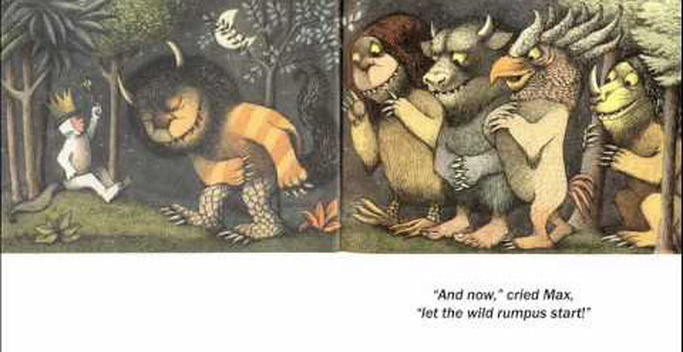
It’s worth looking at Lim’s previous book too, ‘Virtually Venice’ which he constructed for the Venice Biennale in 2004. In it, he imagines Venice as Kublai Khan after conversations with Marco Polo. LIM, C.J. and LUI, E. (2011) Short stories in two and a half dimensions. Oxfordshire and USA. Routledge. THATFIELD. (2011). Virtually Venice. Now urbanism: Mapping the city [online] Available at: https://uwcitiescollab.wordpress.com/2011/12/16/virtually-venice/ [Accessed 15 December 2016] Fig 1: Maurice Sendak: Where the Wild Things are. (1963) Harper and Row SIPE, L. (1998) How picture books work: A semiotically framed theory of text-picture relationships. Children’s literature in Education Vol 29 (2) p97-108 [online] . Available from: http://web.a.ebscohost.com.ezproxy.herts.ac.uk/ehost/pdfviewer/pdfviewer?sid=52fb9a64-da7b-46b2-8ea3-ac13be3fa4d4%40sessionmgr4010&vid=1&hid=4109(Accessed 13 December 2016)
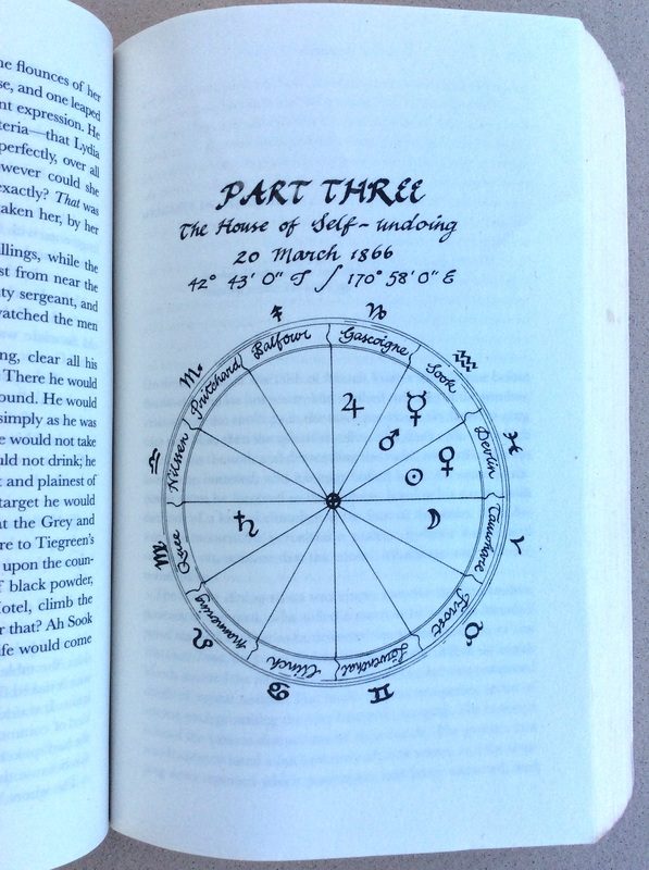
Sipe has a PhD in Children’s literature and has a research interest is in the development of literary understanding. I’ve chosen this article as I’ve introduced text as an integral element in my illustrations and want to clarify how they are read and understood with each other. In this article, Sipe examines the image-text relationship within picture books, but it is relevant wherever image and text exist together. The article begins by referencing alternative descriptions of the relationship using metaphors from music (antiphonal, duet), science (interference) and geology (plate techtonics). Sipe then briefly explains other approaches to defining the image text relationship, and includes the ideas of Barthes, Nodelman and Lewis, among others. Sipes theoretical approach is phenomenological. He identifies the relationship as a synergy, where the value together is stronger than the values individually. Sipe then systematically refers to a range of literary theories that examine the reader response to a text, and their perception of meaning. He goes onto explain the reflective process of reading a book and how this creates a tension between wanting to read on with the words, but dwell on the images. He suggests that the way a picture book is read invites re-reading because the tension stops a full-speed-ahead read. The second part of the article is about transmediation, and uses the semiotic theories of Pierce to explain how a reader moves between the dual sign systems of visual and verbal to create an understanding of the whole text. A double page spread from “Where the wild things are’, by Maurice Sendak is analysed through a Piercean semiotic triad (simpler than it sounds!). Plainly put, it’s where the eyes travel over the narrative space, and how the reader interprets and relates the visual and verbal signs. This is a useful and concise dissection of how text and image work together. It has a thorough bibliography for further study, and an overview of the leading theories. Particularly useful for my own project is the idea of hyperlinking between text, image and from page to page. fig 1 Barbara Hilliam. A Chart in The Luminaries, by Eleanor Catton (2014) Granta Books MORGAN, C. and EVANS, S. (2016) The Illustration report: The new Canon. Varoom. (32). Winter p 34-43. This article, The New Canon, appears in the Winter 2016 issue of Varoom magazine, which focuses on ‘The New’. Seven ‘leading thinkers’ in the field of illustration were asked to propose five examples of excellent practice for a new Canon.
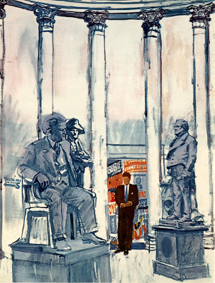
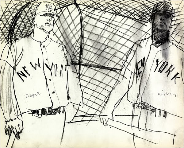
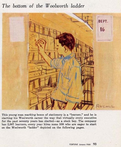
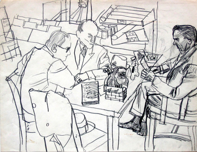
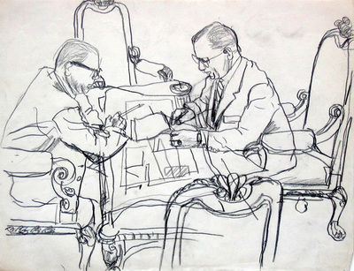
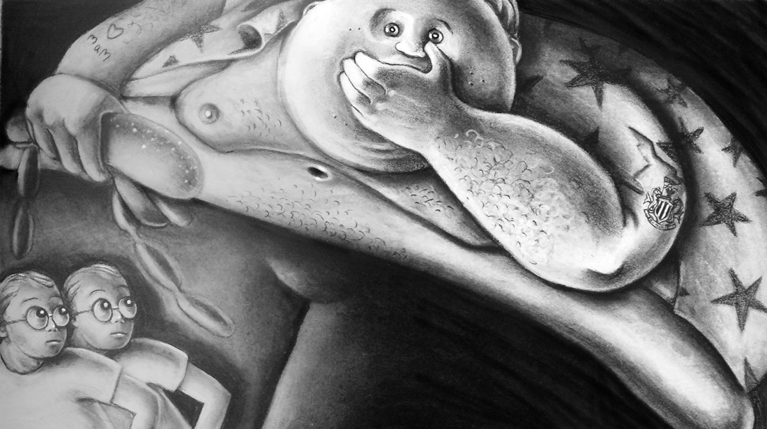
Most of those interviewed offered individual practitioners or specific publications. Two of the seven, Catrin Morgan and Sinead Evans suggested an holistic solution to the brief. It’s interesting to note that theses two are Illustration Lecturers, engaged in day-to-day undergrad teaching. Catrin Morgan is a Senior Lecturer in Illustration at Falmouth University. Her research background is in the relationship between fact and fiction. In the article, Morgan suggests a new and alternative ‘Canon’ of illustration practice. Rather than name individuals, she has instead proposed five images, each of which use a different strategy in their relationship with text. The strategies are: Ekphrastic: The image is not described but can be inferred. Nodal: Images that are re used over and again in different contexts Incidental: Images that replicate age, wear and tear to connote authenticity. Social: Images that illustrate our lived life. Structural: (fig 1) Images, which are more akin to diagrams and reflect textual structure rather than narrative content. Sinead Evans is a Lecturer at Norwich University and Editor of the illustration bi annual, Limner Journal. She suggests a skills-based Canon based on the following principles: Friendship: To encourage collective working and supportive relationships. Mediation: To bridge the gap between audience and subject. Articulation: Clear ideas and the ability to communicate visually and verbally. Discovery: Curiosity for new ideas, materials, processes and resources. Reflection: Honest evaluation and the ability to embrace, and learn from mistakes. Their holistic approach to forming a new Canon is more useful than indentifying individual practitioners, because the ideas are transferable, between projects and between disciplines, and it can evolve over time, with the aquisition of new knowledge, and the development of techniques, processes and platforms. Fig 1. Robert Weaver. Kennedy's last chance to be President. (1959) Esquire Magazine. Robert Weaver is one of the great visual journalists. He was passionate about drawing from life, and was influenced by contemporary young artists and film makers such as Ben Shahn and Roberto Rossellini. Weaver believed that Art and Illustration were very closely allied, and sought to include personal expression, comment and content-full narratives into his work. This attitude really changed the perception of illustration practice in 1950's America, when most illustrators were considered craftspeople, commercial artists who decorated, but didn’t comment. There's a background to the emergence of illustrators like Weaver. When television arrived in more and more homes, it began to siphon off advertising revenue, so magazines, dependent on their money, were left with smaller budgets, and more pages to fill. In addition, the late 50’s and 60’s were a time of major political and social upheaval in America. Weaver identified with the idealist ‘new frontier’ politics of Jack Kennedy and with the youthful optimism of post war America (fig1). “Robert Weaver was Jack Kennedy, and the old guys were a bunch of genial but corrupt Eisenhower’s” (Dowd 2008). In the Art world from the early 1950’s, contemporary painters were embracing abstract expressionism. Figurative work was unfashionable, and painting was about the act of painting. As the decade progressed, Pop Artists back-lashed against this intellectually elite practice and painting started to reference comics, adverts, and graphic design. It was inclusive, accessible, and its narrative was about real lives and popular culture (Heller, Arisman 2004 p.43) Weaver drew on the expressionist aesthetic, using colour as an emotive tool, with broad expressive strokes of paint. He juxtaposed elements of story in multi layered composite drawings, using graphics, posters and typography to contextualise and inform. It is no accident that alongside books, websites and other resources devoted to visual journalism in the 60’s, you’ll find the names of the Art Directors who commissioned them. These men and women gave Weaver and his contemporaries the space and the freedom to investigate and draw what they saw in the world. They were trusted to fill sometimes up to eight pages in an issue. Leo Linni who worked for Fortune magazine 1948-1960 sent Weaver to illustrate an article entitled “What’s come over old Woolworth?” (fig 3). Weaver sketched on the spot, a hierarchy of employees, starting with the Stock room boy all the way to the board members. He barely altered the illustrations for print except to wash over with colour. Richard Gangel, Art Director for Sports Illustrated, regularly commissioned Weaver, including 'Spring training', an iconic series of Baseball players published in 1962 (fig 2). Others include Robert Benton and Henri Wolf at Esquire, Charles Tudor at Life Magazine and Cipe Pineles, Art Director at Conde Nast. Without the vision of these people perhaps illustration wouldn’t have developed in the way that it did. Fig 2. Robert Weaver. Roger Maris and Mickey Mantle (1962) Sports Illustrated What we need today are some more visionaries: In an ideal world, where power is back in the hands of Art Directors, who aren’t scared or too hand-tied to commission, and who see a value in the voice of the illustrator. There’s not much money that’s true, but there’s a lot of space in a digital news story (I really like how Matt Whilley and his team at the New York Times are presenting stories). On the other hand, Robert Weaver might have something, allying himself with Fine Art. Maybe producing a set of beautifully printed illustrations, which inform, comment and shed light on a subject in a new way would be something worth keeping. I’ll steal Benjamin’s idea of the 'aura’ here, and suggest this as an alternative reason to commission. Fig 3. Robert Weaver. What's come over old Woolworth? (1960) Fortune Magazine The chairs get more and more elaborate as you go up the corporate ladder. Art Directors Club (1980) Henry Wolf. Available at: http://adcglobal.org/hall-of-fame/henry-wolf/ [Accessed 12 December 2016] DOWD, D. (2008) Super Tuesday: Robert Weaver’s Kennedy suite.[online].Available at: http://ulcercity.blogspot.ae/2008/02/super-tuesday-robert-weavers-kennedy.html [Accessed 12 December 2016] HELLER, S. and ARISMAN (2004) Inside the business of Illustration. Allworth Press. New York ZALKUS, D. (2012). Visual Journalism; the Artist as Reporter - Part 2.[online]. Available at: http://todaysinspiration.blogspot.ae/2012/05/visual-journalism-artist-as-reporter.html [Accessed 12 December 2016] ZALKUS, D. (2012). Visual Journalism; the Artist as Reporter - Part 1 [online].Available at: http://todaysinspiration.blogspot.ae/2012/05/visual-journalism-artist-as-reporter.html [Accessed 12 December 2016] The Twins (2000) The Independent. Conte and pastel As I read Male’s keynote presentation about the power and influence of illustration (see blog post 11/12/16), it brought to mind a commission I was given about fifteen years ago.
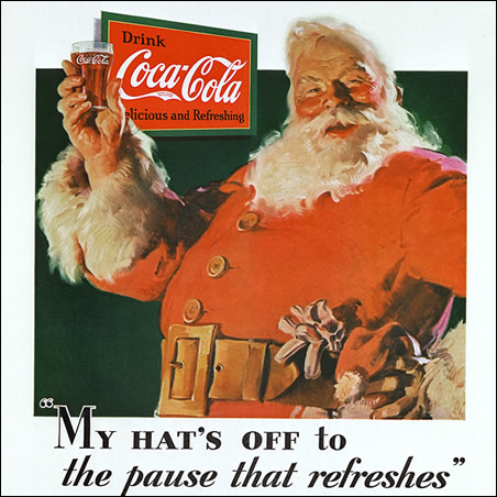
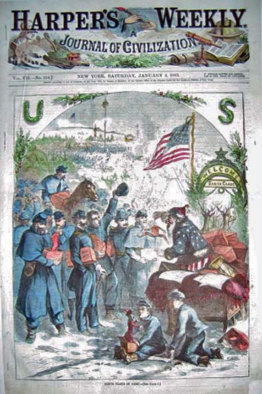
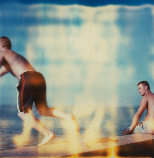
I was working for an educational publishing company, making lots of illustrations for different projects to be used in home schooling in Africa and the States mainly. All going well until I was asked to work on a Christian teaching project. I’m not religious, but the subject was the nativity story, and that has such a weight of existing iconography behind it that I thought I’d be on safe ground – no ground breaking here. I must admit that part of me was a bit wary of the influence of these teaching aids and I did feel a responsibility towards the audience. I decided to approach it with rigorous research into the history, architecture and dress of the period. My clients were happy with the reconstruction of the setting, the dress and artifacts in the illustrations. My camels were on point. The first revision came because they thought the characters were too ‘Middle Eastern’. Of course, I hadn’t realized that I had to draw from a middle class, white, western aesthetic. The final straw (that broke the camel’s back) came when I was called in to discuss the angels. “Can you make them look more like real angels?” I couldn’t and so we parted company. A lesson learned and a commission, which I doubt, I’d accept now. On a lighter note, I had a fight with my husband whilst illustrating a children’s story for the Independent newspaper. The main character was a very fat giant, chasing twin boys. I was able to turn that very fat giant into a portrait of my husband, complete with his very distinctive Newcastle United tattoo. Revenge is sweet and illustration can be a powerful thing. There are so many sites that discuss this subject, but here's a few interesting and quite diverse links about ethical design. The first is a piece about the Vatican's report into advertising 'God and the ethics of advertising' and featured in Creative Review as part of an ethics edition. The second, is written by the Simon Moore, the designer who rebranded UKIP in 2015. and poses some controversial questions (is bad design worse than poor ethics?). The third is a link to Milton Glaser's famous 'Road to Hell' essay, in which he gave his students increasingly difficult ethical questions to answer. BURGOYNE, P. (2007) God and the ethics of advertising [online] Available from: https://www.creativereview.co.uk/god-and-the-ethics-of-advertising/ [Accessed 17 December 2016] MOORE, S. (2015) Rebranding UKIP [online] Available from: https://www.creativereview.co.uk/re-branding-ukip/ [Accesed 17 December 2016] GLASER, M. (2002) Ambiguity and truth [online] Available from: https://www.miltonglaser.com/files/Essays-Ambiguity-8192.pdf [Accessed 17 December 2016] Fig1. Haddon Sundblom. Thirst knows no season (1931) The Coca Cola company. Haddon painted this version for Coca cola every year until 1964 fig 2. Thomas Nast. Santa Claus in camp (1863) Harpers Weekly This was the first depiction of Santa. Nast had him supporting the Union, later clothing him in red. MALE, A. (2015) The power and influence of illustration: A future perspective [online]. Available at: http://repository.falmouth.ac.uk/1580/ [Accessed 8 December 2016] The power and influence of illustration: A future perspective was presented as the keynote address at the CONFIA conference in April 2015, at Falmouth University. Subtitled ‘ How will an increase in multiculturalism, globalization, political and environmental change affect the future needs and expectations for visual communication?’ The paper poses many questions. Male examines the historical tradition of propaganda illustration. He uses even-handed examples from the early 15th century to the present day, and from the East, Middle East and West, concentrating initially on the persuasive and inflammatory power of illustrations, which comment on religion. He uses the feedback from his current undergraduate students to gauge whether attitudes towards propaganda journalism and satire have changed over the last decade. He establishes that propaganda journalism has an impact and uses examples, which include Sue Coe’s work on animal welfare and apartheid, and Thomas Nast’s election winning work for Abraham Lincoln, and his work supporting slave emancipation. He brings the same attention to children’s literature, arguing that it is a particularly potent vehicle for subversive propaganda. The Iranian (Persian) book ‘Little Black Fish’ for example, contains coded symbolism, which was apparently only understood by the revolutionaries who deposed the Shah. In children’s literature, the difference between Eastern European and Western sensibility is noted. Male asks an important question of the audience, about where their own ethical boundaries lie and uses his own practice to draw examples from. These are from the fields of Advertising and Education, the latter, he suggests, is where illustrators must show particular responsibility. These examples are looked at in the light of context and culture. The conclusions drawn are thus: Student evidence suggests that there is less tolerance of explicit, and offensive material, and that illustrators should work within globally accepted ethical guidelines. An awareness of other cultural contexts will be paramount, and should inform sensitivity to diversity and beliefs. The study asks pertinent questions about the global future of illustration, given that we operate in a multi-cultural, multi-faith world. It acknowledges that content can be deemed offensive depending on viewpoint. The examples are drawn from first hand knowledge and from visual communication history. The Coca Cola Company (2012). The true history of Santa Claus.[online].Available at: http://www.coca-colacompany.com/stories/coke-lore-santa-claus [Accessed 10 December 2016] (fig 1) Rhiannon Adam. Dreamlands Wastelands 2014 During my memory of place project, I began to research ways to convey nostalgia. Part of this research took me to the aesthetics of analogue media (notably photographs and home cine film). I wanted to try and identify the colour palettes which conjured up nostalgia, and also discover why this might be so. I looked at my own family photographs and films, and I trawled instagram and pinterest looking for old polaroids and Kodachrome photographs. I found that the colours were a reflection of the chemical deterioration and exposure to light, and that this was dependant on the type of film, how it was processed and how it has been kept. Polaroids are particularly sensitive to light and air pollution, and will crack, fade and discolour (they shouldn’t be stored with other photographs or be exposed to a maximum light of 40 candles!)(Wilker 2004: 5). Photographs can have a yellow/ orange cast, or blue, the colours can fade uniformly or have a high contrast, with some colours more unstable than others. Why are these old photographs so emotive? It’s not just the subject matter, but the materiality of them which is so appealing. Over the last 30 years there has been a massive acceleration in the development of new media technology, and the more this has advanced, the more nostalgia there is for technology of the past (Shrey 2014 p27). It seems that the aesthetic materiality of an old film, record, postcard, is very desirable today. These things show their age, and each time they are used and handled, they decay even more. The marks of deterioration are signs of someone else having appreciated the media. Robnik calls these ‘textual ruins’ (Robnik 2005 p.59), and mimicking a textual ruin is a common enough aesthetic approach (just Google ‘distressed effect’ ). When this is duplicated, it connotes this history, pleasure and connection to the past, when it doesn’t actually exist. Rhiannon Adam is a photographer who explores the aesthetic of deterioration as a symbol of memory and nostalgia for childhood. Rhiannon spent most of her childhood living on a boat at sea. Her photographs in this series 'Dreamlands Wastelands' explore a 'rose tinted' view of a British holiday(fig 1). Colour palettes: Old photographs and postcards In addition to this research, I was also curious about the popularity of Instagram filters, many of which, replicate the 'vintage' aesthetic of old photographs. There are plenty of studies into the subject, Instagram is just one of many apps which aim to recreate analogue film processes, for example Retrocamera, Camerabag,and Hipstamatic. In one such study,' Pictures or it didn't happen', Gant suggests that the addition of an aging filter gives a materiality and authenticity to an otherwise transient collection of data.The idea is that because the faked accidental light leaks and deterioration are not accidental, the subject becomes twofold, the thing that is being photographed, and the photographic process itself (Chopra Gant 2016). He also makes an interesting observation that most social media photographers are younger than the technology they are emulating. He draws the conclusion that real or personal memories aren't the goal, but rather an aura of the past, a general rose tinted, 'wasn't it better then' feeling of the past. CHOPRA GANT, M. (2016). 'Pictures or it didn't happen:Photonostalgia, Iphoneography and the representation of everyday life' Photography and Culture.[online]. Vol 9 (2) p121-133.Available at:
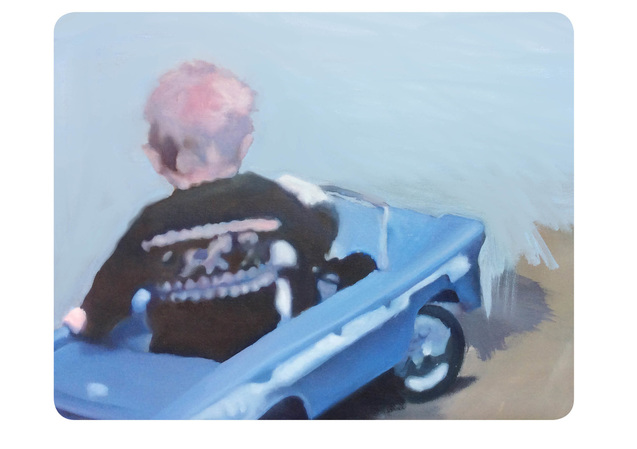
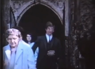
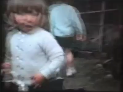
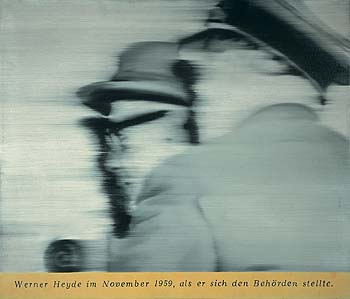
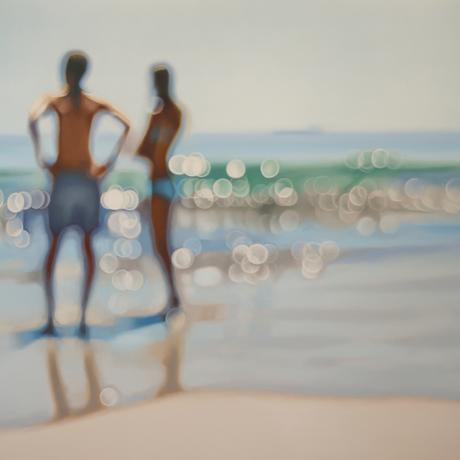
://www.tandfonline.com/doi/full/10.1080/17514517.2016.1203632?scroll=top&needAccess=true [Accessed 8 December 2016] ROBNIK, D. (2005) Mass memories of movies: Cinephilia as norm and narrative in Blockbuster culture. In DE VALK, M. and HAGENER, M (eds). Cinephilia, movies, love and memory ) [online] Amsterdam. Amsterdam University Press. Available at: http://www.oapen.org/search?identifier=340201 [Accessed 8 December 2016] SCHREY, D (2014). Analogue nostalgia and the aesthetics of digital remediation. In: NIEMEYER, K. (Ed). In Media and nostalgia, yearning for the past, present and future. [online]. Available at: https://www.researchgate.net/profile/Dominik_Schrey2/publication/287508471_Analogue_Nostalgia_and_the_Aesthetics_of_Digital_Remediation/links/56775b5a08ae0ad265c5b79d.pdf [Accessed 6 November 2016] WILKER,A (2004). The composition and preservation of instant films [online]. Available at: https://www.ischool.utexas.edu/~cochinea/pdfs/a-wilker-04-instantfilm.pdf {Accessed 7 December 2016] Paul (2016) Oil on board Home movie stills We tend to keep old family photographs, even when they are faded and the chemicals are deteriorating. We keep them if they are a bit blurred or accidently composed and cropped. These qualities are really a metaphor for memory, and I thought it would be an interesting aesthetic to explore. I used an old family film as my resource for a painting of a child in a pedal car, which borrows the pinky, blue colour palette, and then softened the edges to indicate a blur. In later images I emphasised this even more. Many artists are exploring this idea, but the master of blurred painting technique is Gerhardt Richter. In 1973, in an interview with Irmeline Lemeer, he explains: “I've never found anything to be lacking in a blurry canvas. Quite the contrary: you can see many more things in it than in a sharply focused image. A landscape painted with exactness forces you to see a determined number of clearly differentiated trees, while in a blurry canvas you can perceive as many trees as you want. The painting is more open” (Richter, Dietmar, Obrist 2009 p 81) Gerhardt Richter. Herr Heyde (1965). 65 x 55 cm. Private collection A really interesting experiment was undertaken by Korean duo Shin Seung Back and Kim Yong Hun. They developed a software which would scan an entire movie, and every 24 frames, would record an amalgum of all found faces. The resulting prints offer a visual mood and a memory of time spent. It's worth looking at the whole series which includes films such as Amelie, Old Boy and Black Swan. Shinseung Kimyonghun Avatar Portrait (2013) Pigment inkjet print.Variable dimensions An alternative way to look at blur and memory can be seen in the 'Sea' paintings of Phillip Barlow. They are reminiscent of an overexposed holiday snap, taken from the wrong angle. He uses blur to describe a saturation of light with a high tonal contrast. Just the kind of image that occurs when the sun is behind the subject. Phillip Barlow. Glassy (date unknown) Oil on canvas. 1.2 x 1.8 m MCARTHY, T. (2011) Blurred Visionary: Gerhardt Richter’s photo-paintings. The Guardian.[online] Available at: https://www.theguardian.com/artanddesign/2011/sep/22/gerhard-richter-tate-retrospective-panorama
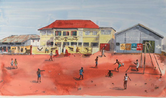
[Accessed 5 December 2016] RICHTER, G. DIETMAR, E. and OBRIST, H. (2009). Gerhardt Richter: Texts, writings, interviews and letters 1961-2007 Thames and Hudson. London. fig 1 Tim Vyner. Mantse Palace (date unknown) The paper argues for an explicit philosophical grounding to be embedded within illustration education. Moszkowicz states that adopting clearly developed methodologies, would address current, often superficial and style-centered practices, and create a place for a deeper understanding of the role and function of illustration practice. Moszkowicz’s proposal to foreground philosophical practice was made in response to an acknowledgment that much contemporary illustration is concerned with style over content (Zeegan 2012). I have chosen one section, which examines the work of Tim Vyner through the phenomenological methodology of Paul Ricoeur. This is the final part of a paper, which introduces the philosophy of phenomenology and also looks at the work of Eisner, a Graphic narrative illustrator.
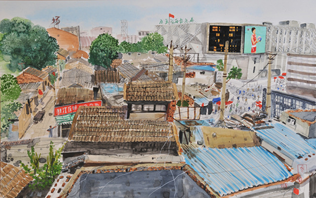
Moszkowicz’s proposal is particularly relevant to my research. As an art school educator, one of my responsibilities is to develop curriculum, which will encourage students to explore and find their own view of the world, and is concerned with communication of meaning, not style. Moszkowicz uses the philosophies of Paul Ricoeur and the work of Tim Vyner, to draw attention to methodologies, such as phenomenology, which she believes are already implicit in Illustration practice. She proposes that Ricoeur’s ideas are an appropriate intellectual partner to illustration practice, because his work deals with narrative and time. He believes in a phenomenological hermeneutical approach, which makes sense of the world through language. He considers important the idea of a narrative identity, which isn’t just within the language/ image, but is also the identity of self, both image maker and intended viewer. Moszkowicz uses an analysis of the work of Tim Vyner to illuminate and support her argument, suggesting that Vyner is unusually adept at employing “semantic pertinence” (Ricoeur 2004: 178) in his illustrations. His ability to include and communicate the content that he wants, within the tight world of agency commissioning is also why he was chosen as an example. Moszkowicz maintains that with philosophical thought an illustrator will understand and be able to employ sophisticated metaphor and mimesis to tell a bigger picture, and give social and historical context through their work. This is an important point she makes, as a critical engagement with the wider issues would give work depth and cultural relevance. She argues that illustrators should also be able to situate their work not just as an object, but as a conduit for re imagining and re experiencing the world and that Ricoeur’s ideas would explicitly help them to achieve this. Vyner is a reportage artist. The work analysed is a series of single illustrations made at world sporting events. Vyner selects subjects that allow him to explore the impact of an event on the lives and habitat of ordinary people. Moszkowicz dissects Vyner’s illustration through Ricoeur’s three-stage process of mimesis. In the first stage Vyner uses his understanding of the world to compose metaphors, which describe the narrative. He describes this as a “kit of parts” to be read (from an interview with Vyner by Mozkowicz, March 2012). This metaphoric language, invented by Vyner, is read by the viewer as though through Vyner’s eyes. In the second stage, Vyner makes the work, which is organized and composed using his semiotic language. Moszkowicz states that this is the stage where the components, detail and composition of the image have the potential to take the viewer out of the frame and so to a longer, weightier narrative. Vyner does this by knowingly leaving visual markers that refer to bigger socio-political events, and to history, for example, in the small, understated details that identify the house (which at first glance looks like a club house), as the Museum of Slavery (fig 1). In a second image, the intentional juxtaposition of local vernacular adverts against those of corporate sponsors highlight the disparity between rich and poor. Colour throughout the illustrations is chosen to give a general ‘sense of place’. Vyner has constructed a multiplicity of narratives within his images. Finally, in the third stage of mimesis, the image is read. Moszkowicz asserts that through this reading, the reader is transported to other times and places, through the diachronic imagery in the illustration, (the slave trade in this instance). If philosophy was taught within illustration, then perhaps this is where it would impact the most. Illustrators would understand that their work has the power to take the viewer somewhere else, through the illustrator’s eyes, and this Moszkowicz states would be a transformative experience for the reader. Moszkowicz holds Vyner up as a model of illustration practice, and attributes a phenomenological hermeneutic thinking behind his process. Through a close study of several of his works, she has established that Vyner is able to successfully demonstrate Ricoeur’s ideology in an intuitive way. Her analysis of the way he makes meaning is descriptive and logical, following Ricoeur’s mimetic rules. His ‘kit of parts’ description belies a solid grasp of semantics, which are the essential tools of an illustrator. She stresses that Vyner is not typical of many illustrators because he is able to bring in bigger social statements, and demonstrate an acute awareness of the world, yet be employed for other reasons. It is apparent that she has carefully considered Vyner as her choice of example, and indeed earlier in the paper, she discusses her reasoning for this, discounting other illustrators who, at first glance, are better placed. Moszkowicz has been able to identify an underlying philosophy in the working methods and illustrations of Vyner. This supports her conclusion that philosophical methodologies are inherent (even if they are implicit) in illustration practice. MOSZKOWICZ, J. (2012). ‘Time and Narrative: How philosophical thinking can support the discipline of Illustration’. VaroomLab [online]. 1 p.45. Available from: http://www.varoom-mag.com/?page_id=315 [Accessed 6 December 2016] RICOEUR, P. (2004). The rule of Metaphor: The creation of meaning in language. [Online]. (1986) London. New York. Routledge. Available from: https://books.google.ae/books?id=aDup1b6CNTYC&pg=PA178&lpg=PA178&dq=semantic+pertinence&source=bl&ots=pQqazk7Gm8&sig=kKVF39DDYE-d8a6iO-x2Y3J-wrU&hl=en&sa=X&ved=0ahUKEwjU4Y6FveHQAhUFNxQKHQdzBi0Q6AEIMjAE#v=onepage&q=semantic%20pertinence&f=false [Accessed 6 December 2016] RICOEUR, P. (2006) Time and Narrative Volume 1.(Trans.) MCLAUGHLIN, K and D, PELLAUER [Online] Chicago. University of Chicago Press. Available from: http://www.al-edu.com/wp-content/uploads/2014/05/Paul-Ricoeur-Time-and-Narrative-vol1.pdf [Accessed 6 December 2016] ZEEGAN, L. (2012). Where is the content? Where is the comment? Creative Review. [Online]. Available from: https://www.creativereview.co.uk/where-is-the-content-where-is-the-comment-2/ (Accessed 5 December 2016]. Tim Vyner Hutong, AWRS World Games.2009 MOSZKOWICZ, J. (2012). How philosophical thinking can support the discipline of Illustration. VaroomLab [online] (1) p 45-58. Available at: http://www.varoom-mag.com/?p=4171. (Accessed 10 November 2016).
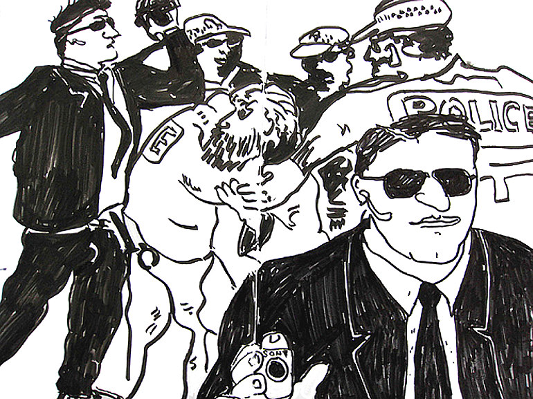
ZEEGAN, L. (2012). Where is the content, where is the comment? Creative Review [online]. Available at:https://www.creativereview.co.uk/where-is-the-content-where-is-the-comment-2/ [Accessed 5 December 2016] Moszkowicz is a senior Lecturer and Researcher in Visual Communication at Southampton Solent University. Her paper was delivered at the VaroomLab Illustration conference at Plymouth University, September 2012. In her paper, Moszkowicz argues for an explicit philosophical grounding to be embedded within illustration education. The intended audience are educators, particularly within the Art School system. It is written as a response to current thinking that illustration is insular and lacking any critical or perceptive engagement with the wider world (Zeegan 2012) Moszkowicz uses the philosophies of Paul Ricoeur and the work of Tim Vyner and Will Eisner, to draw attention to methodologies, such as phenomenology, which she believes are already implicit in Illustration practice. Moszkowicz broadly explains the methodology of phenomenology and then uses Ricouer’s ideas of mimesis to dissect the work of Vyner. She concludes that by making philosophical study explicit, illustration students will be able to position themselves and their work within wider contexts, and re appraise the role and value of their discipline. This is a useful article, which could encourage, through curriculum development, a deeper understanding of the processes and methodologies of illustration practice, and it’s transformative effect both on the reader and on the creator. Mario Minchiello; (2007). APEC summit Sydney, Sydney Morning Herald Reportager.org was set up in 2012 by Gary Embury and the University of the West of England, as a response to the lack of illustrated visual journalism. It’s aim is to help launch, support, and show work by visual essayists and reportage illustrators.
Embury’s paper sets out to discover whether there is a growing place for reportage illustration, where it sits compared to a photographic essay, and why there are so few commissions for this type of work. The information has been gathered from interview with practitioners, educators and members of Reportager.org. It concludes that visual journalism has a positive future, particularly with self initiated, authorial work. Examples are drawn from illustrators such as Joe Sacco, Bo Seremsky. Martjane Satrapi, Olivier Kugler and Mitch Miller. The paper addressed the reasons why there is a gap for visual journalism to grow, why it is perfectly placed to fill that gap, and examines the advantages drawing has over photography in this area. There was no evidence from those commissioning illustration, and this would have been a useful and practical addition. EMBURY, G. (2013). The new visual journalism. VaroomLab(1) p 61-70. [online]. Available from: http://www.varoom-mag.com/wp-content/uploads/2013/01/VaroomLab_Journal_IssueOne.pdf [Accessed 20 October 2016] |
Archives
August 2020
Categories
All
|


 RSS Feed